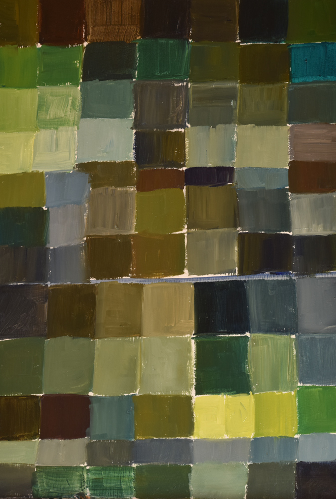
I did some excercises in creating greens.
Palette: ultramarine blue, cerulean bleu, yellow ochre, cobalt yellow medium, cobalt yellow light, cobalt red medium and titanium white.

I did some excercises in creating greens.
Palette: ultramarine blue, cerulean bleu, yellow ochre, cobalt yellow medium, cobalt yellow light, cobalt red medium and titanium white.

A post for Sketchercise:
This morning’s walk provided me with greens.I have to admit that I don’t enjoy drawing/painting/rendering leaves. Maybe it is the greens in them I shy away from. I find green a difficult colour to paint in watercolour as well as oil, or any other medium. Beautiful in nautre, difficult to render. Too much green can make me feel quite ill. The wrong greens can look very artificial. Green can easily look flat and lifeless. Like white, green isn’t just ..green. It absorbs and reflects its environment and by looking closer you’ll see browns and reds, yellows and blues…a whole spectrum of colour. And then we get transparent greens and saturated greens, which you can’t paint with only green from a tube or pan. Even oils are difficult and mix differently than watercolour, for one – we have a white which can be added to green in oils, then making it less transparent of course. Which explains why I rarely paint with green, but prefer mixing a green. And I love to mix it directly it on my paper or canvas to have the colours flow into one another, giving dimension and vibrancy and life, even if the green isn’t the “perfect” green. I sometimes add olive green(Schmincke) and the very different olive green(W&N).
Please do tell how you paint greens?!
…apple branch…
In these three sketches, I have used more or less the same palette:
Cobalt yellow pale(W&N), cobalt yellow deep(W&N), yellow ochre light(Schmincke), lemon yellow(W&N),french ultramarine(Sennelier), cobalt blue(Sennelier), Prussian blue(Sennelier), Cerulean blue(W&N), Paynes gray(W&N), burnt sienna(W&N), raw umber(Sennelier), olive green(Scmincke).
…walnut branch…
…acorn branch…
All sketchesdone with rotring pen and watercolour in watercolour moleskine
My palette has arrived, I have finished making my first sketchbook and I painted my “homepage”.
The brass palette is handmade and engraved by Craig Young in England. Not cheap, so it meant saving seriously for a few months, which I did religiously. It folds open to hold 16 colours, with mixing pans on either side and at the bottom(not seen), is a ring to hook your thumb through. A brass container to hold water hooks onto the side.
My colours I put in there for now are(from left to right) Naples yellow, Cadmium yellow, yellow ochre(apology, I painted raw umber instead of yellow ochre in the picture!), raw umber, alizaron crimson, cadmium red, burnt sienna, burnt umber, olive green, hooker’s green, ceruleam blue, kobalt blue, french ultramarine, prussian blue, payne’s gray, ivory black. I do play with other colours which I’ll just drop onto the mixing pan. I don’t need a big mixing area, since I prefer mixing directly on paper.
My sketchbook is 19x25cm, which I find ideal for me…big enough to do landscape and architectural sketches and I can do a few quick smaller sketches all on one page and it fits perfectly into my bag(see photo above). I also decided not to cut the paper, but to tear them(See photo below) – I like the ruffle edges they make, it resembles watercolour sheets. I love the rustic, handmade look for a sketchbook.
Along with my palette, I have in my sketchbag a pencil, a rotring pen(.25) a tiny spraybottle to wet the paint, and a travel petit gris brush, size 0. I also got a great idea from Mel Stabin(my favourite watercolour artist)..and started using an old kitchen spatula, with the handle broken off to lift out some whites, which works great, along with an exacto knife which does the same thing, just much sharper highlights.
And here is my “homepage”. I covered my hard outcover on the inside with watercolour paper(Arches CP,185g) as well and painted my “homepage” over the whole of the two first pages. The scene is the back of our home and part of the neighbours, painted from the terrace. I thought it would be a fitting opening in my sketchbook. Now off to start making the rest of my books, with an alteration here and there…maybe embossing my name on the cover and adding an elastic that folds over from the back(like the moleskine)