A post for Sketchercise:
This morning’s walk provided me with greens.I have to admit that I don’t enjoy drawing/painting/rendering leaves. Maybe it is the greens in them I shy away from. I find green a difficult colour to paint in watercolour as well as oil, or any other medium. Beautiful in nautre, difficult to render. Too much green can make me feel quite ill. The wrong greens can look very artificial. Green can easily look flat and lifeless. Like white, green isn’t just ..green. It absorbs and reflects its environment and by looking closer you’ll see browns and reds, yellows and blues…a whole spectrum of colour. And then we get transparent greens and saturated greens, which you can’t paint with only green from a tube or pan. Even oils are difficult and mix differently than watercolour, for one – we have a white which can be added to green in oils, then making it less transparent of course. Which explains why I rarely paint with green, but prefer mixing a green. And I love to mix it directly it on my paper or canvas to have the colours flow into one another, giving dimension and vibrancy and life, even if the green isn’t the “perfect” green. I sometimes add olive green(Schmincke) and the very different olive green(W&N).
Please do tell how you paint greens?!
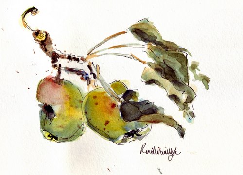
…apple branch…
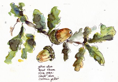
In these three sketches, I have used more or less the same palette:
Cobalt yellow pale(W&N), cobalt yellow deep(W&N), yellow ochre light(Schmincke), lemon yellow(W&N),french ultramarine(Sennelier), cobalt blue(Sennelier), Prussian blue(Sennelier), Cerulean blue(W&N), Paynes gray(W&N), burnt sienna(W&N), raw umber(Sennelier), olive green(Scmincke).
…walnut branch…
…acorn branch…
All sketchesdone with rotring pen and watercolour in watercolour moleskine


Your greens are lovely! What’s the problem? Anyway, I mostly use Sap Green in watercolours, – I find it mixes quite well with any of the Siennas and Yellow Ochre.
I agree: your greens are lovely.
One nice thing about nature: the changing light, the changing growth of leaves and trees, and the changing seasons mean than almost any color you render will have been true at some point… {grin}
That said, I’m always frustrated with my greens… even though I’ve checked out work by great artists, and sometimes the greens they use are effective but not accurate!
My teacher has a strategy. For each ‘color’ she uses in a painting, she plans a ‘pure’ color, a warm version and a cool version.
Another note, if you mix a cool yellow (Lemon) with a warm blue (Ultramarine), you should bet a grayed or muddy green.
Have a look at dear Bruce MacEvoy’s site (aka ‘the Handprint guy’) to see how he uses mandalla-like structures to study color mixtures. (http://www.handprint.com/HP/WCL/tech15.html Scroll down to see the colored paint wheels.)
I follow all your posts and enjoy your work! Thank you.
I agree greens are tricky. When I am out sketching I only use a small W/N watercolor palette with 2 greens. I add some red to either one to get a variety of greens. Do you sketch in ink first and then add color? Loving your style.
great pages it just puts me in the mood to give it a go
Yes, green is tricky. Lately, I’ve used only my Aquarelle (Staedtler) pencils as they are “safer” in my handbag, but I prefer W&N tubes and never use just one. For shadows in leaves/trees I usually mix red and green-warm red in summer and cool red in winter.
Sometimes I lay a wash on my pages beforehand, but that requires discipline and that’s a bit short around here !
All lovely, Ronell, but I want to take the acorns home with me 😉
(Just a note – in this town, we are not well-served when it comes to art supplies. The local store has a limited range and if we order the freight sends costs into the stratosphere.)
I like what you have done here, Ronell, but I agree with you and the the rest that bought green often does not cut it, and so it has to be blended with other colors. Since you see that the real life greens have other colors in them, I suppose it would help to add those colors to your bought greens. Deborah writes that she adds a little red, so I have to try that, now.
Since I am a beginner, I personally make a lot of mixed green messes on my palette and pages, trying to learn. I will follow this post, hoping to learn from you and the rest. But I do think the greens in these sketches are delightful.
annie
Yes, green is tricky. Lately, I've used only my Aquarelle (Staedtler) pencils as they are "safer" in my handbag, but I prefer W&N tubes and never use just one. For shadows in leaves/trees I usually mix red and green-warm red in summer and cool red in winter.
Sometimes I lay a wash on my pages beforehand, but that requires discipline and that's a bit short around here !
All lovely, Ronell, but I want to take the acorns home with me 😉
(Just a note – in this town, we are not well-served when it comes to art supplies. The local store has a limited range and if we order the freight sends costs into the stratosphere.);. All the best!!
Ronell, your greens in this post and the last one look just lovely to me. Very varied and realistic. I love all of the plants you’ve sketched. The acorn branch is my favorite. I am wondering though if the boss reads your blog. If so, he might have caught on that you aren’t working on the property in his absence. Maybe if you share some of that yummy tomato salad with him when he returns he will forgive you. 😉
Your greens are rich and lush and I agree they can be a challenge especially if an artist has a landscape that is primarily green, we have to really look hard to find the subtle variations in the greens. Exaggerating those small differences and heightening the warms and cools helps lend richness to an all green painting. It makes sense to me that with greens (and all colors) being influenced by surrounding colors and light that using other colors to make green would give the most rich and life like greens. I use a limited palette and rarely have a green on my palette but when I do use it I choose viridian which is utterly ghastly on it’s own but is an incredibly versatile color and makes a beautiful sap green as well as luscious limes and everything inbetween.
Love these latest sketches. One would never guess that leaves are any difficulty for you at all. You have a very lovely mix of greens.
I like your greens; they seem very lively. I almost never use greens straight out of the tube. Usually I’ll mix a green from whatever limited palette I’m using (blue, yellow, red). Sometimes I’ll take a tube green and then mix something else with it. But really, I tend to avoid greens too. I’m never quite happy with them.
I just LOVE these acorns ! They are so lovely !
Ummmmmmm these sketches are delicious, and My Kind of Exercse!!
Greens have always been the biggest color challenge for me with my limited abilities. I learn so much from your example and palette choices. Always love your work!
Your comments about painting the color green are so true, Ronell, but the leaves in these paintings are beautiful (and believable).
The top two watercolors looks like sumi-e paintings, one stroke with the brush charged with several intensities and colors. They are beautiful.
I recently came across your blog and have been reading along. I thought I would leave my first comment. I don’t know what to say except that I have enjoyed reading. Nice blog. I will keep visiting this blog very often.
Susan
http://sketchingdrawing.com
I love seeing your loose watercolors and the the muted greens you used. It was always great going to the EDM Superblog to know when you had new entries on your blog – it is so sad that now I actually have to remember to schedule visits to some of my favorites blogs. Happy painting!
How lovely! You have a way of leaving white space that eludes me and my overworked watercolors. I understand when you say that green is difficult; it is for me, too, and everywhere around me there’s green, with trees and shrubs of every type and size and all green. When I try to paint what I see it becomes a green mess. Buy today I’ll try to paint something green like you do, a bit of a branch, a few leaves, and a variety of green… surrounded by and including lots of white.
Hi Ronell,
your sketches are great, as always! –
Yes, I first thought about taking porcellain painting further, but now I`m sure I will go on with my watercolours, acrylics and black and white sketches! It was an interesting experience, though.
I think I’m going to add Scmincke olive green to my palette. I love how you’ve used it!
Oh, definitely, greens are the hardest. I love yours here, though–they’re all rich and beautiful!
It’s a pity you don’t like painting them, because I just love the way you paint leaves and nature! It’s always so vibrant!!
As for me, I much prefer painting greens with watercolour, because I find it more difficult with acrylics. I hate adding white and maling my colours less transparent when I paint leaves and plants, which I don’t mind when I paint other things… actually, when I come to think about it, I feel the same with blues…
I used to paint with sap green essentially, now I tend to forget it and mix a ‘cold’ green (veredian, hook, phtalo) to burnt sienna or burnt umber, with a little indigo, or a little red to make it more olive…
I love your handling of this subject!
Luscious artwork…
Green is a hue I fall in love with repeatedly!
Rebellious creature that I am, I don’t stress over subtleties; I just create multiples and drool over the transitions…
http://djsstudio.blogspot.com/2009/05/week-one-of-studio-challengewhee.html
http://djsstudio.blogspot.com/2009/05/monday-night-i-was-having-e-mail.html
http://djsstudio.blogspot.com/2009/07/gutting-it-out.html