Oil painting

A few days ago I painted this corner of the Loire in oil.  Unfortunately I fiddled with it afterwards while it was standing on the easel in the atelier to dry, resulting in losing some great first strokes and giving the water this almost “swimming pool” colour. Knowing well I have this addiction, I normally hang a painting immediately on the wall when done and then I don’t touch it…on the easel however, I always see something that needs fixing!

…ombre et lumiére..

ombre-et-lumiere1oil on canvas, 30×30 cm (11.8×11.8 in)

I am leaving for Coin Perdu in Correze for about three weeks, which will be sort of a solitary retreat. And since I’m leaning towards oil painting for now, I’ve decided to pack all my oil stuff for some plein air painting for which the opportunities and subjects there are boundless. So I had a stack of boards, in different sizes, cut at my hardware store, and prepared them at home with  first  a coat of acrylic primer, then a coat of mixed gesso and modeling paste and lastly a coat of gesso. (after the method by David Curtis).

Some years ago I played around with modeling paste on canvases and several other surfaces, as can be seen in the next two paintings. Given a coat of gesso or acrylic primer, it provides a nice textured surface for some expressive work in oil  and other mixed media.

…urn 1, mixed media on canvas…

urn1

…detail of texture(with modeling paste)..

detailurn1

…urn 2, mixed media on paper…

smallurn

…detail of texture(with modeling paste)

smallurn-detail-21

…pineapples…

pineapplesoil-12-13-2008-3-20-52-pm

oil on canvas, 30×30 cm.

…detail of texture(with modeling paste)…

pineapplesoildetail

Clementines

Encouraged by Jana and Robyn, I took up the oil brush again. Not to do paintings, but oil sketches. Went to my cute little art store, solved the world’s problems along with the owner, got a lovely compliment from a french guy buying paper and walked out with more brushes and some oil paper in blocks, which I’ve never used before. They worked out perfectly for the oil sketches! Another alternative would be to prime drawing paper with acrylic paint as an undercoat. I prefer the blocked canvas paper which is sturdy. I really enjoyed getting back to oils… missed the smell and sensuality and drama of oil paint. Now that my tubes have been opened again, I hope to do much more oil work again, sketching as well as painting. I used clementines as subject for both watercolour and oil sketches.

The watercolour was done in molekine, using a .25 rotring(which I love for the brilliance of the ink and its fine point), watercolours and a petit gris brush, no 0.

clementine1.jpg

For this oil sketch, I started by laying a thin wash(oil and turpentine) roughly over an area, let it dry and directly sketched the clementines with brush and oil and a drop of Venetian turpentine as medium.

clementine3-06-jan-08-6-26-02-pm.jpg

I had some oil paint left on my palette and attempted a second clementine sketch, changed the composition and lay a contrasting colour background which is once again a thinned wash, using plenty of turpentine with a big brush.

clementine2-06-jan-08-4-55-11-pm.jpg

Urns and tennis

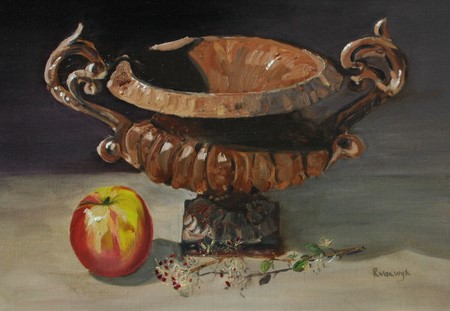
I have a passion for urns…Medici, cast iron, soapstone, old stone…I love their shape and touch and smell, their poise and nobility. While I watched the tennis today, my hands looked for something to do. Since I’ve been longing to do a few urns for some time now, I thought I should start right away with the first one, an old French cast iron urn. The first painting is oil on linen which I did a few years ago.It is close to my heart.

 dsc_0002-3.jpg


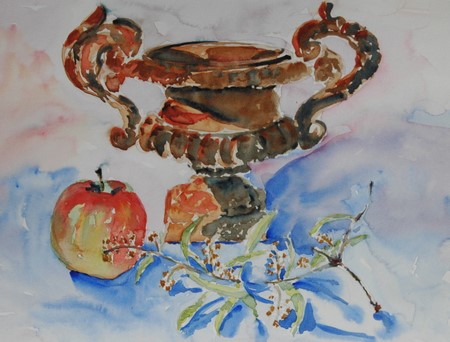
This next one is one of three watercolors I did while watching the ladies final at Roland Garos this afternoon. I wanted to go for the same composition as the oil just for comparison. This was the last of my attempts and probably the one closest to what I intended. Maybe because by this time the tennis result was a clear cut thing, no doubt who the winner would be, so my attention was mostly on the paper.The shape is awkward though, but that doesn’t bother me too much. I’m never too fixed on realism. My watercolors are a bit sloppy lately, but my goal is to bring more expressionism into them, to accentuate color more and the big one …to fiddle less

 dsc_0009-1.jpg

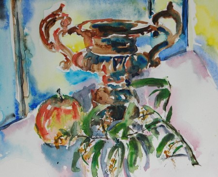
This sketch comes in second. I’m not happy with it, although there is something that makes me look at it again. It is very wild and uncontrolled, dark a with lot of confusing leaves….that actually sounds very much like my mind…. or it could be the tennis. By this stage in the match, it was a very one-sided gameAnd finally, my first attempt right at the beginning of the match, when I still thought it was going to be a tough battle and my attention was eagerly turned more to the game.

dsc_0001-11.jpg

There is really no interest in this one, very flat and floating with no excitement. After these attempts I had enough of this urn, however much I love it. I’ll try some others for next time

dsc_0005-8.jpg


22 comments:

Dave said…
Interesting exercise to paint the same thing three times. I like all of them, but I think I agree with your order of preference. The oil is outstanding!
June 9, 2007 7:43 PM  
Renate said…
I’m in love with the oil painting. There is something very intriguing in it. Maybe the way you get the light … Don’t know. But it’s great!
June 9, 2007 7:59 PM  
Sandy said…
Love the oil painting too and of the three, my favorite is the bottom one…just gorgeous. But…I’m still thinking about that outdoor kithen and alfresco cooking…yum…I’m hungry..
June 9, 2007 9:35 PM  
🙂 Silvia said…
All of the paintings are great, but the first one is really outstanding :)!! It’s understandable that you are very fond of it.
June 9, 2007 11:18 PM  
Robyn said…
The urn was the winner on the day. Beautiful all ways. I love the oil – awesome, but my favourite of your ‘tennis’ paintings is the first one. Smashing!
June 9, 2007 11:18 PM  
janey said…
Yes the oil is excellent but actually my favorite is the last one. I like the freedom and the colors.
June 10, 2007 12:43 AM  
Jenny said…
I like them all, and there’s no reason for me to pick one over the others. :)Sports on television cannot hold my attention and something else to do must me found. Needlework is my usual choice if it’s at an uncomplicated point.
June 10, 2007 2:07 AM  
caseytoussaint said…
Ronell, whenever I stop paying attention I miss another fabulous post! this is great, I’ve always loved that oil, and it looks wonderful here – I think my favorite of the watercolors is the last one – it looks like you’re sure of your subject and know where you wanted to go with it, maybe because the composition is a bit simpler. Delightful.
June 10, 2007 4:56 PM  
Lindsay said…
Wow! You have an amazing eye for detail! Great wc sketches too.
June 10, 2007 4:58 PM  
Jana Bouc said…
hese are all amazing and I’m so envious of your oil technique. I think my favorite images of the urn though are the first one (the oil) and the last one. The surface of the urn in the oil is perfect and it looks so weighty and substantial. The values in the last watercolor image are just right and it really stands out.
June 11, 2007 6:45 AM  
hfm said…
Love your persistency… and for me they are good and transparent as I like them.
June 11, 2007 10:40 AM  
Anita said…
Oh Ronell, we share a passion. I can’t pass an urn or a column or ballistrade without running my hands along it’s curves…Which can be rather embarassing for those who are with me at times. LOL!
Your paintings are beautiful. The oil is exceptional and the watercolours show your personality, knowledge of subject and love of colour.
Truly gorgeous!
June 11, 2007 12:40 PM  
Africantapestry said…
Thank you for your commenst…I rellay apprecieate it.
Ronell
June 11, 2007 4:09 PM  
Bonny said…
Fabulous, Ronell! To me, all the urn sketches are interesting for their own sake. I don’t think I’ve ever concentrated on drawing one thing several times to compare the results. Neat idea!
June 11, 2007 4:21 PM  
Laureline said…
Hey, I love that last one—so what am I, chopped liver?? The whole group is such fun to see and, as always, your narrative is charming and compelling, too.
June 11, 2007 8:10 PM  
Sandy said…
Each rendition is wonderful in it’s own – I cannot sit still to do the same subject repeatedly but this shows how much variety can be achieved – Great work as always.
June 11, 2007 8:17 PM  
wagonized said…
Such an intricate shape to draw / paint. The first one blows me away, quite simply. I think oil is very appropriate for the weight of the urn.
June 12, 2007 5:22 AM  
Carole said…
How do you find the patience to paint the same thing three times! You must learn a lot from doing so. I love the differences in these three paintings, and they all have characteristics that I like. I like the loose expressive style and think you’ve achieved it well. My favourite is, of course, the oil painting. It’s simply stunning.
June 12, 2007 6:31 PM  
Tonniece said…
As always lovely pieces. The oil painting is wonderful Ronell.
June 13, 2007 11:13 PM  
Andrew said…
wowoowwww these are just awesome…so did you watch much of the match:>
June 14, 2007 12:01 AM  
Serena said…
WOW! I’m flat out painting something once let alone four times. The oil is my absolute favourite but the other’s are vibrant with colour and flair. Well done, Ronell ~
June 20, 2007 6:20 AM  
platitudinal said…
I love how your paintings give us hints of your self, Ronell. Today we learn that you have a passion for urns and the reason behind it.Your talent never ceases to amaze me.

I give you… Christeen

A fun exchange in emails between Christeen and me a while ago, turned into work in the end! Not that this wasn’t fun. Too much, I would say…I actually attempted three paintings! But it sure was difficult…I was very worried about not doing justice to her beauty and wonderful character. She assured me though it is about the process, and not the end result(for this time, I’ll believe it, although I would normally believe that the result does carry quite a bit of weight too!)
She also sent me a picture of her and her brother at four years, which I’ll attempt a bit later. By her own words, she now once again has the playfulness, enthusiasm and humor she had when she was four and that was what I tried to capture. I can see it so obviously in her face, but capturing it, is another thing. She has these amazingly long eyelashes behind which she carries the sparkles of mischief, a mouth full and round with humor, and hair, wild like a free roaming lioness. See Christeen’s excellent take on this!!…. as well as the original image here
So, here I give you Christeen…..in graphite on paper; then watercolor on Arches and last, oil on linen.

dsc_0008-4.jpg


dsc_0026-2.jpg

dsc_0003-5.jpg


shirley said…
All absolutely wonderful! What a huge project….
May 6, 2007 4:21 PM  
Christeen said…
Ronell, you are one amazingly talented woman!! Holy smokes! These are awesome!
May 6, 2007 4:22 PM  
Dave said…
Ooh, these are all good. I think the graphite one is my favourite. No, perhaps it’s the oil. Although now I come to look at the watercolour again…
May 6, 2007 4:29 PM  
caseytoussaint said…
Wow, Ronell, these are great! My favorite is the oil – it ‘s so full of life.
May 6, 2007 5:09 PM  
Lin said…
RONELL! STUNNING! GORGEOUS! PHENOMENAL WORK! MERCY … THIS IS TRULY OUTSTANDING!
May 6, 2007 5:35 PM  
Claudia said…
I like the watercolour one the most! Wonderful work, all three are superb!
May 6, 2007 5:44 PM  
Nina Johansson said…
hese are just lovely! Incredibly good, you captured Christeen perfectly!
May 6, 2007 7:01 PM  
martín said…
Ronell, I absolutely agree with Christeen, you´re amanzingly talented!!! I can’t say I have a favourite, I can’t decide since I like the three of them very much. Each one has its own character. GREAT JOB!!!
May 6, 2007 7:45 PM  
Sarah said…
Amazing paintings – isn’t it interesting how the different media seem to emphasise different aspects – they’re all alive and vital, but the watercolour shows a more reflective person, the oil brings that hint of mischief out more and in the charcoal drawing she looks more curious, almost about to challenge someone (I should say – that’s how they look to me anyway)
May 6, 2007 8:45 PM  
SCquiltaddict said…
Ronell THese are just super…they got better and better as i scrolled down the page…cant decide WHICH is my favorite…they are all MAGNIFICIENT!!
May 6, 2007 9:19 PM  
Cathy (Kate) Johnson said…
Oh, Ronell, your charcoal is GORGEOUS, and so is Christeen!
May 6, 2007 9:21 PM  
Cathy (Kate) Johnson said…
Ooops, graphite! You did such a rich, deep job with it I just assumed it was charcoal!Read ALL the words, Kate…*G*
May 6, 2007 9:23 PM  
Silvia said…
All of the portraits are wonderful :), but I think I like the second one even best :))!
May 6, 2007 9:58 PM  
Kristin Saegaert said…
Wow! I think I like the graphite the best, but with your amazing talent it’s really hard to commit to that!!! Thanks for sharing your art with us!
May 7, 2007 12:42 AM  
Shelly McC said…
Stunning painting!
May 7, 2007 1:49 AM  
Kay Cox said…
Ronell, these are just beautiful. I aspire to be able to paint like you someday. Thank you so much for sharing your lovely work. Lucky Christeen!
May 7, 2007 2:23 AM  
bec said…
What a fun project! My favorite is the watercolor… nice play of light on the subject. Did Christeen draw you?
May 7, 2007 2:35 AM  
Robin Neudorfer said…
I love the graphite drawing. So spontaneous. What a fun project
May 7, 2007 2:49 AM  
Nancy said…
I love the graphite drawing and keep gong back to it (your model is beautiful by the way). I love to look at your site – I leave feeling inspired.
May 7, 2007 4:12 AM  
Serena said…
These are awesome! I think my favourite is the graphite. 🙂
May 7, 2007 9:08 AM  
Africantapestry said…
Thank you for all the comments -Sarah…thank you for being so observant..you’re spot on! I’m so glad you did see a littel of what I tried to do…see down below.Nancy: Yes I had a beautiful model to work with!Bec: and Christeen does have a snapshot of me, so when she has time, she’ll do one too.note: This was a very intimidating experience for me….doing a painting of someone you don’t know or haven’t met face to face, and in a weird sense is actually a friend(like you all would agree, I’m sure) and all you have to work with is a photograph – you haven’t seen some personal mannerisms, like how her mouth moves when she smiles, how she crinkles her nose, how she plays with a string of hair, how the light in her eye changes…anything that can give you an idea of something more than physical…. Normally I would’ve preferred to have Christeen’s face say something more than just displaying rendition, tell more of a story, but I didn’t feel confident enough to do that. Who knows, maybe our paths might cross and then I’ll redo these.
Ronell

May 7, 2007 9:15 AM  
Regula Scheifele said…
So I’m going to chime in and say how much I admire your work and your courage as well… I couldn’t say which one I like the most, since they all have a different feeling to them, like showing different aspects of Christeen’s personality? – Would be interesting to know which one she thinks portrays her best?
May 7, 2007 9:29 AM  
Ujwala said…
all three are wonderful but the oil is my favourite 😛 sounds like a fun project and i hope we can see christeen’s work too.
May 7, 2007 12:14 PM  
Tonniece said…
OOOH, I LOVE THEM ALL RONELL, BUT I TRULY THINK THE GRAPHITE IS MY FAVE. I
May 7, 2007 12:35 PM  
Sandy said…
WOW – big WOW you are a master (bowing down before you)
May 7, 2007 3:52 PM  
Robyn said…
I love the graphite one, Ronell. it looks so spontaneous and very much from life. That, I find, is terribly difficult to achieve from a photo which usually lends itself to a more formal portrait. You are very clever – I’m so in awe of the oil too!
May 7, 2007 6:30 PM  
Fanta said…
I like the first one best, maybe because I love graphite, maybe because you truly did capture the child in her expression.
The last one truly looks like a lioness, even the twirls in the background resemble the presence of a lioness! Awesome!
May 7, 2007 9:49 PM  
platitudinal said…
Truly amazing work. You’re not only attempting a likeness of her, but also her essence. That’s very difficult to capture, and yet you did. I think each medium emphasize more of certain characteristic, but all and all they’re all there. Superb job, Ronell.
May 7, 2007 10:02 PM  
Carole said…
Well done – these are stunning! It’s so interesting seeing them done in three different media, and noticing how each gives a different feel. My favourite has to be the oil painting because I am such a huge fan of your luscious way with oils. Oh, to be able to paint like that!
May 7, 2007 11:16 PM  
Anonymous said…
Hello I cant tell you how much your work has inspired me to practice daily and hope that someday I also will be able to turn out wonderful works of art. You are a wonderful artist and I thank-you for letting us see your work hear.
Linda
May 8, 2007 12:49 AM  
mARTa said…
wow! how different they all are yet how smashing! Your blog is always a joy to the viewer!
May 8, 2007 2:13 AM  
Renate said…
Wonderful. They all have there own charm. I love the eyes from the graphite one, but my favorite is the one in oil.
May 8, 2007 8:50 AM  
wagonized said…
It is hard to tell which one strikes me the most — as each of them stresses something different about Christeen. Love her hair in the graphite one.
Thank you, Ronell, for your comments on my funk of the past few days. Your words, which i found on Suzanne’s blog, have stuck in my head ever since i read them. Yesterday, i just showed up at the page… 🙂
May 8, 2007 4:03 PM  
Christeen said…
I keep coming back to marvel at these. I’ve never seen a drawing or painting of myself before, and I enjoy them SO much!Your graphite drawing really captures how my hair feels to me- men have lost watches in it! It can be incridibly difficult to coerce into submission!I love the loose, fresh approach in the watercolor. You’ve made the light SO beautiful- I feel like I’m outside, just looking at it. I am also impressed with how you kept the line of my nosering thin and delicate in the midst of those wonderful washes of color. You’ve got my squint wonderfully.And the oil- wow. The brushstrokes are really lively. Thje background supports your lionine take on my hair, and suggests wind tossing it around (and it was VERY windy the day I took that shot). The colors are luscious. The colors you’ve used for my skin are particularly impressive to me.So, all that said, thank you SO much for applying your creative talents to this swap of photos! You’ve inspired and impressed me, and I’m so glad we gave it a try.

May 8, 2007 7:56 PM  
andrea joseph’s sketchblog said…
Great work Ronell – not just this post throughout your blog. These are great, I think I like the pencil one the best.
May 9, 2007 1:10 AM  
aPugsLife-laserone said…
These are really fantastic! You’re so talented. 😀
May 9, 2007 6:37 AM  
E-J said…
You’ve been so busy! You and Christeen have really taken this challenge by the horns. I think the oil is especially good.
ay 9, 2007 1:52 PM  
Linda said…
These are all great! Christeen’s painting of you is wonderful, too — you two are cooking up some fun stuff! 🙂
May 11, 2007 4:18 AM  
Anonymous said…
Come across to your blog and loved it. I will return.http://tcores.blogspot.com
May 11, 2007 2:40 PM  
janey said…
These are great, I love the color and texture in the last one.
May 11, 2007 6:15 PM  
Africantapestry said…
Thank you for all the generous comments!
Ronell
May 12, 2007 8:26 AM  
phthaloblu said…
What a grand project! I love the graphite the best, but that’s just me. All of them are simply superb.