I struggled with this theme today. Not because I don’t like spices, au contraire, it is a delicious theme and I love it. But the ideas didn’t show up today.I couldn’t fix my pen on a cool composition and the brush didn’t work for me either. My wrist was stiff and unforgiving in sketching these bottles. Instead of having a free hand and sketching with some wonk, which is my usual style, my sketches become overworked and controlled. Not me. Not me at all. In this process of struggle today, I paged back through the last few sketches and artwork I did…and there I saw it; Stiffness and control. Slowly but surely during the last few sketches I moved towards controlling the pen and colour, while they should actually have more of a will of their own. That is how I raised my daughters and that is how I like my art.
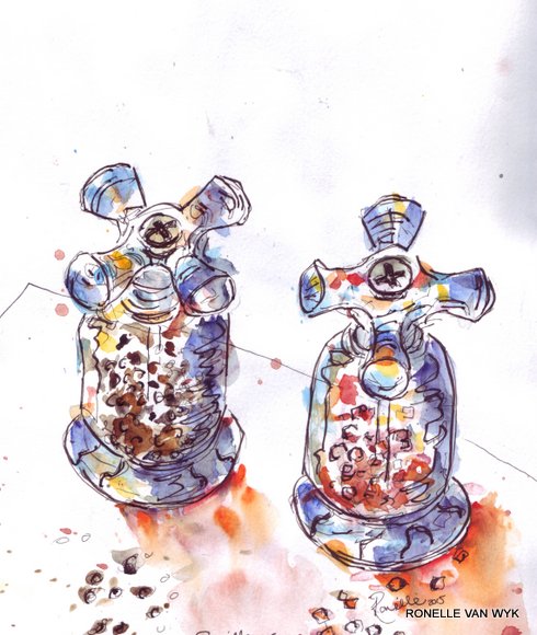
Sketch 1: a himalayan salt and black pepper mill, totally overworked and in good ole French…“n’importe quoi!”
watercolour and pen in Daler Rowney sketchbook,21X29.7 cm

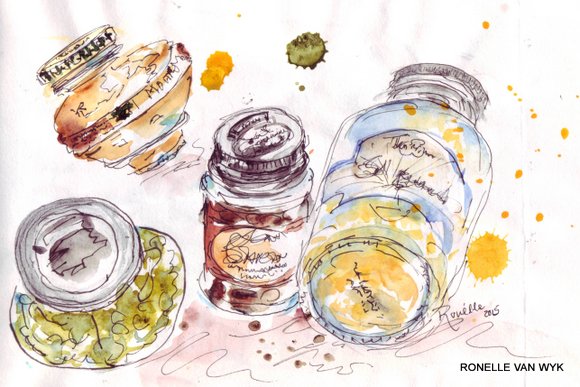
Sketch 2: without interest, overworked, not funk or peps, actually a bit boring.
watercolour and pilot prera pen in Stillman & birn sketchbook, 22.9X15.2 cm
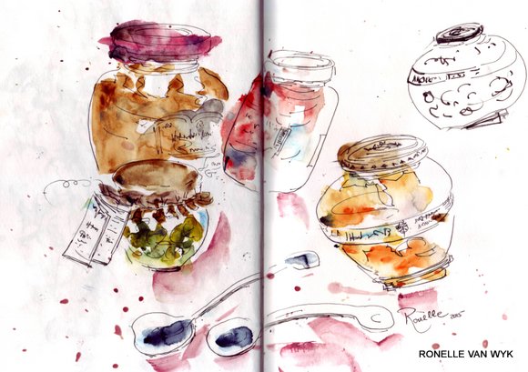
Sketch 3: this ws my last sketch and almost there, but not quite yet. I think I got tired at this stage, but there is a bit more interest in the dynamics, a bit more wonk and interpretation.But still sloppy. (a loose, free style doesn’t mean sloppy.)
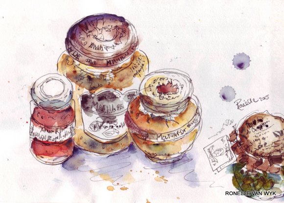
 Sketch 4: This was the second last one and I was a bit angry here, trying and trying and not getting what I want (almost went into tantrum mode…). This sketch is downright sloppy.
watercolour and pilot prera pen in Stillman & Birn sketchbook,14X21.6 cm
 See you tomorrow with sketch(es) on the theme…something hot!
Ronelle
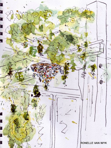
 Chandelier hanging under grapevine