August sketching 2

It is only day 2 but boy, I am having so much fun!  I feel inspired, enthusiastic creative and just in the zone…how many of you can say that this evening? I hope it will last the entire 31 day of August…and beyond. Of course it won’t, but even just a little bit of it will be good enough.

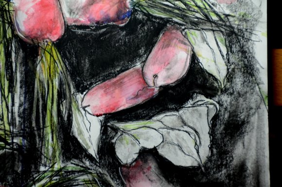
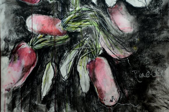
Starting off with my café, which helps get me in the “zone”, I sketches the géraniums just opposite. It was raining, the tourists took up all the other covered spots in our small village, so I didn’t have much choice of going out. In the end I am happy I stayed, it turned out not too bad, after initially starting off a bit slow…


géraniums à Beaulieu 3395x4817Once again, a lot of conversation around me, but it is good in teaching me to focus and listen at the same time.

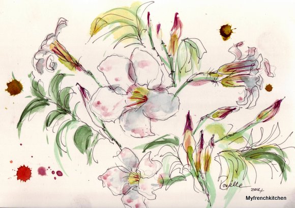
  • I used yellow on the walls with touches of burnt sienna.
  • The roofs were done with ivory black and raw umber and blue.
  • The shadows on the canopies were done with a light wash of cerulean blue.
  • The geraniums done in cadmuim red and the greens in golden green, darkened with phtalo blue.
  • In the shade of the canopy in the background, behind the people dining in the foreground, a touch of light black ivory was applied for shadows.
  • In the foreground the people and tables  just behind the stone wall, closest to me were  done in bright burnt umber.
  • And lastly some yellow ochre touches here and there when the sun came out…

yelows, ocres.. 5494x3461.0001

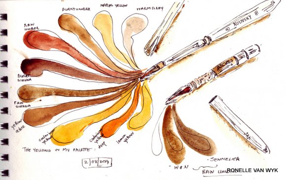
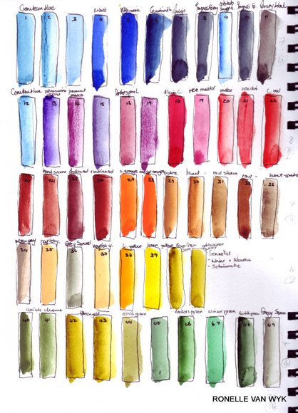
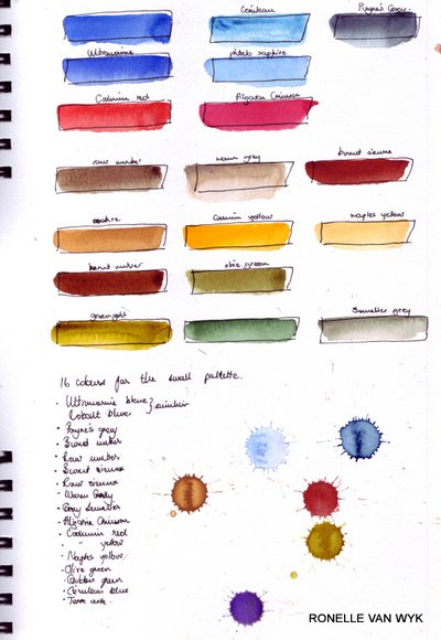
It is a good idea to test the same colour of different brands, because they do sometimes differ. In the above sample at the bottom left I have compared the raw umber of W&N with that of Sennelier. I prefer the Sennelier raw umber which is cooler than that of the W&N.

From top left anticlockwise to bottom: warm grey, naples yellow, burnt umber, raw umber, burnt sienna, raw sienna, yellow ochre, cadmium yellow, cadmium yellow deep, lemon yellow.

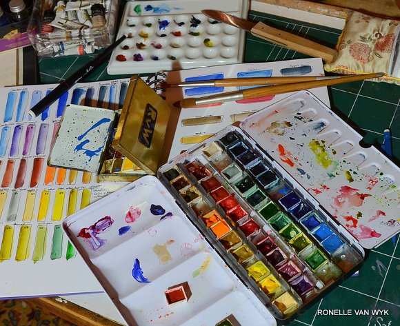
My little pocket brushes are one from Arches…le petit gris nr 6, which broke at some time and I fixed it with tape and now it still works perfectly. The other is a Kolinsky that I have no idea where it is from. all I know is that I have used it for years, so much so that I have lost its cover and now use a piece of plastic that I found which fits over the brush. (See photos down below). So you can see, I am a bit like the mechanic whose car is always in pieces…But look ate those lovely brush points…hold as much or as little water as I want them to!

A new sketchbook from Daler & Rowney which I just discovered and am quite impressed with. The paper is not that heavy, only 160g, but it takes watercolor quite well and I don’t mind a little buckling in a sketchbook. The pocket brushes from top my precious Kolinsky nr 8 with its “unbecoming” plastic cover and the “repaired”petit gris nr 6 below.

pocket brushes 2511x3239

..Kolinsky pocket brush 8..

pocket brushes 3235x2590


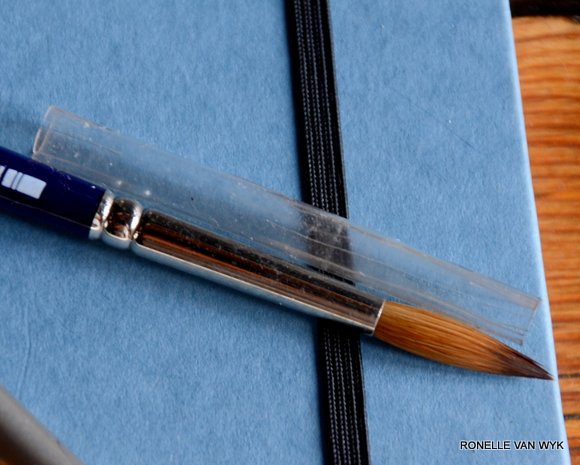
..”taped” petit gris pocket brush 6

  pocket brushes 3330x2715

à bientôt

Ronelle


August sketching 1

I am a lazy person. There you have it. My biggest secret revealed. If I don’t have deadlines and projects and goals, I fall in a slumber of doing less and less and less until I start enjoying doing less. In summer that can happen very easily with the holidays and lazy summer days, lingering by the pool…. So I decided to do some regular August sketching and get back to those sketches I haven’t done for months, years even.  No summer laziness for me then, but pens and inks and aquarelle en all these new sketchbooks I’ve ordered and papers waiting to be turned into sketchbooks.

I use the rotring art pen quite a bit, and the ink allows me to add a little water(not too much) to bleed the lines. See the little sketch of the ink bottle below which was done with a rotring artpen.

ink bottle artist pen

I also love drawing with inks and especially J. Herbin and Sennelier inks. They are good inks, easy to find and much cheaper than ordering inks from other countries, just for the sake of having inks.

…See, the pens are waiting!…pen and J .Herbin ink, “Café des isles”

copper pen holder

My palettes are organized and ready in waiting, mostly comprised of Sennelier and Winsor & Newton watercolor in tubes and pans. The palettes still need more cleaning, but you will never see perfectly clean around my art table..it confuses me completely and I can’t work…too afraid I’ll make mess!

bitg and small pallette 2315x1888

Color chart of all the colors in my palettes. Sometimes I get confused and start using one color thinking it is another, especially if they  are close in hue, so it is good to arrange and make sure the right colors are in their right places.

I use about 40 – 45 colors in the larger palette. .which stays at home. Not that I use all the colors every time of course. My tiny travel kit, which I have been using for years now, take about 16 colors which is just perfect.

paletete in aquarelle 1

Colors for my smaller palette…still deciding between some blues and yellows, but I’ll get there. I feel like change sometimes..

paletete in aquarelle 2


In a later post I will cover my use of color and palettes, the inks I love, the pens, pencils…all very simple. I am by far not so prolific and efficient as the urban sketchers or other daily sketchers out there. But more later in the month…this is just to get me started for the month of August.

So until tomorrow…sleep well!

Ronelle


Centre ville de Beaulieu s/D – sketch

I haven’t done urban sketching for quite some time. Since we have arrived here at our farm, Coin Perdu, I have mainly been doing plein air painting in the countryside or food sketches, which go with my foodblog, Myfrenchkitchen. I also mainly work on watercolor blocks, because I use a lot of water and pigment which mix directly on the paper and with a sketchbook, I have to wait quite a while before I can turn the page to do a new sketch. With the watercolor block I just ear off the paper, set it aside to dry and start a new sketch. Later I bind the sketches together. Funny thing is, people are more interested in buying the quick sketches than completed paintings, so in that sense a block works much better ( except for me, because being the total useless business person I am, I just give them away for free, thinking I can’t possibly charge money for a sketch? Well, as long as it brings that person joy, then it is OK. But…somewhere I have to draw the line though…)

So, I will get back to making my own proper sketchbooks with Arches HP paper. I have also ordered a few new sketchbooks.

The sketch below was done this morning (on Arches watercolor block, HP) in the company of friends at the market, which I found quite distracting, not being used to sketching with all that buzz around me anymore. The old buildings in France are wonky by default and below my faulty perspective makes it even worse…but for the most part, I am quite happy with this sketch after such a long dry spell.

..centre ville Beaulieu s/D..

aquarelle on Arches wartercolor block, HP, 18x26cm

aquarelle - centre ville beaulieu 6018x4216 6018x4216

..à bientôt

Ronelle

Dipladenia flowers in aquarelle.

We have a humid summer this year…hot and humid which isn’t normal for us. One can clearly see the effect on us humans. Our energy gets sapped by the humidity and many a day I , who adores heat, feel like a limp fish on these mucky days. The Mediterranean plants even more so. These Dipladenias enjoy heat and dry summers , so too they  struggle with the heavy humidity.  With not their usual abundance of flowers, they still bloom and show off beautifully, quite different from me, who struggled to stay focused on my sketching with no blooming and showing off in sight.

…dipladenia…

..watercolour and pen on Arches watercolor block, HP, 18x26cm..

dipladenia 5844x4108

à bientôt

Ronelle

My favorite perfumes in aquarelle.

When life trips me, I head to the perfume shelves. To indulge and forget for a while about the hardships of life. And I never leave without a tiny bottle of perfume. That is my biggest sin in life and I will gladly carry my punishment one day, should there be. I use a spritz of perfume every day everywhere…to town and  to the opera, to do the washing to weed the garden, after my shower and before I drop my head on my pillow.

there is a secret to good spritzing. Do you remember the way Malan and Mamy used to dab their eau de cologne behind the ears, on the wrists…well, those were the old days. The French way to do it, is to spray a cloud of perfume in front of you in the air and then walk through it. No harsh , overwhelming, nose itching smells, but rather a gentle caress on the skin, interacting gently with the oils of the skin to bring forth the  subtle underlying notes of the perfume.

..l’eau d’Issey by Issey Miake – light and soft for summer..

perfume 1


..Intense, by Dolce & Ganbbana- for those times I feel passionate and ..intense….

perfume 2


..baiser volé by Cartier – reminds me of Arabian nights…

perfume 3


..Coco by Chanel -my favorite perfume which always make me feel elegant , and brings out my French side!

perfume 4

So, come on ladies, spritz your perfume, time is too short not to!

à bientôt

Ronelle

Radishes in charcoal and watercolor

Continuing my experimentation with large formats, different mediums and free strokes. Still sticking with charcoal, which is an unforgiving medium, but exactly that fact gives me the freedom to “play” freely. You can”t start over every time you make a mistake; so you  are forced  to work with the mistakes, which can either lead to great discoveries, or total mess ups  – not to be seen as a bad thing. I also prefer working with the dark charcoal, and one can see in the images below the really dark black it gives. I don’t use fixatives.. I have the impression it doesn’t work in any case..

…radishes in charcoal, watercolor and watercolor pencils, 42x60cm..

Radishes in watercolor and charcoal 3251x3976

I chose radishes, cut off most of the leaves  to expose mostly the stems, thew them out on the table and chose a composition with only a few radishes.

..the start – in charcoal lines and watercolor washes, using lot of water and allowing it to run…

Radishes in watercolor and charcoal 3232x4683

After finishing, I stood back and the watercolor looked too washed out against the dark charcoal, so I added watercolor pencil, washed it to blend and give darker color, and here and there I left some pencil marks to echo the charcoal lines.

…radishes – close up 1..

Radishes in watercolor and charcoal 4928x3264-001

Far from being a perfect piece and it won’t end up in an exhibition, this was another good exercise in getting rid of “fear”.

….radishes – close up 2…

Radishes in watercolor and charcoal 4928x3264

…radishes – close up 3…

Radishes in watercolor and charcoal 3264x4928

Onto some some more work!!!

à bientôt

Ronelle