A french guesthouse

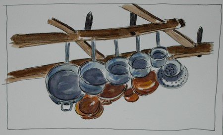
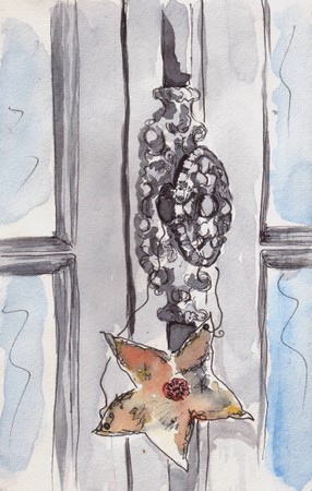
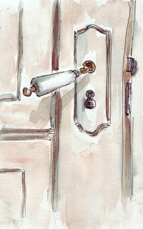
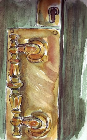
I’m doing some paintings for a lovely Irish lady with a lovely Irish accent! She has a beautiful guesthouse in the countryside, not far from here. These paintings were done in the beginning of spring, so I’ll have to redo them when her roses are all in full bloom. I’d like to do another painting of the house too, since I think I’ve done this one a bit gray? The house dates from the seventeenth century with lovely little turrets which were used by monks. For more information on the guesthouse http://frenchguesthouse.com/ click on the images to enlarge. Both were done in pen and watercolor on Fabriano HP paper. 30.5 x 45.5 cm.

dsc_0001-10.jpg

dsc_0005-7.jpg

12 comments:

Robyn said…
I don’t think it’s too gray. I think it is elegant and inviting and beautifully loose in your painterly style. I also love the Wisteria around the tower.
April 30, 2007 7:28 PM  
🙂 Silvia said…
Such a beautiful house – I really can imagine how fantastic it will look with all those roses in bloom 🙂
April 30, 2007 8:30 PM  
Sandy said…
What a lovely home and you have captured it with a light bright touch, I want to do home WC sketches and now that I understand saving whites better perhaps I will give it another try – you inspire me!
April 30, 2007 9:55 PM  
Dave said…
This looks like a lovely house; it is certainly a lovely painting.
April 30, 2007 11:45 PM  
Lin said…
OH MY GOSH, RONELL!! THIS IS ABSOLUTELY GORGEMENTOUS!! It look so romantic and beautiful!! FANTASTIC WORK, my friend!
May 1, 2007 12:34 AM  
Nancy Van Blaricom said…
This building looks so intreging… romantic yet mysterious at the same time. Lovely painting.Hmmmm, I’ve all of a sudden realized that I have never watercolored a building…. how odd.
May 1, 2007 4:00 AM  
platitudinal said…
This is a beautiful house and I think you portrayed it so well in your painting. The grey roof gives the house a formal air, yet not cold. It looks great as it is, but now that you mentioned full bloomed roses — it does make me wonder how it would look like with them.Is that the monks’ turret with the wisteria climbing around it? Very pretty!
May 1, 2007 4:14 AM  
Cin said…
hi Ronell, many thanks for your comment today, your blog is new to me too, lovely watercolors! I hope one day to learn this medium.
May 1, 2007 5:49 AM  
mARTa said…
I agree with Robyn, not too grey. I love how you work in watercolor. I have noticed you like HP paper. I’ve only tried it once and wasn’t sure about it as it wasn’t quite what I am used to. I might have to give it another chance. La maison c’est tres beau!
May 1, 2007 7:18 AM  
aPugsLife-laserone said…
WOW! When I saw the house one, I was like “OHHHhhh, my goshhhh”. These are just gorgeous! I love architecture and I just love when someone draws or paints architecture beautifully, which you do. 🙂
May 1, 2007 9:21 AM  
Anita said…
Oh Ronell it is perfect just as it is! Simply gorgeous!
May 1, 2007 7:42 PM  
phthaloblu said…
What a beautiful home. Inviting, quaint. You did a really wonderful job on these.

Spot the differences

Play along and spot the differences between the two pictures.

difference-1.jpg

Stand on your head to read the answer at the bottom.

difference-2.jpg

casey said…
My, you are productive! I really like this one too. I’m running out of adjectives here!
March 25, 2007 5:43 PM  
Teri C said…
Good thing I have a laptop:) because the only difference I see is the lighter one on the bottom.Wonderful painting!!
March 25, 2007 7:18 PM  
Lin said…
I must be blind but I don’t see a difference — but I LOVE the sketch!!!
March 25, 2007 8:03 PM  
aPugsLife-laserone said…
I can’t see any differences, but I’m not awake, LOL! But I do love the painting! 🙂
March 25, 2007 9:04 PM  
🙂 Silvia said…
There are 7 differences??? My oh my… and I am only able to spot 2 of them…
What a creative idea :)!
March 25, 2007 9:41 PM  
Ujwala said…
Spotted 2 too and if you’re counting the colour difference then one more 😀 neat idea for the ilo.
March 26, 2007 6:01 AM  
Africantapestry said…
Hi everybody…thanks for the comments and playing along…there are really 7 differences(lines), maybe a bit more subtle than expected..it is actually hard to see on the small image and not easy to flick between the two images..but thanks, it is more about the idea anyway.
ronell
March 26, 2007 8:20 AM  
phthaloblu said…
This is such a cool idea. And the paintings are wonderful even tho I can’t see the differences.
March 26, 2007 2:45 PM  
Fanta said…
I only spotted three differences.
Thanks for commenting on my blog, your works are wonderful, and so glad I found you through Casey’s blog.
March 28, 2007 11:40 PM  
MrsSnowy said…
Wow – there is so much that pleases me here. First of all, I love the simple but so effective style of this sketch – now I’m going to bookmark your blog and enjoy it when I’ve done some housework! ciao Robyn
March 29, 2007 1:16 PM  
Carole said…
Well, I found 3 plus the colour difference! Lovely paintings. I like your pen and wash of the fisherman too.
March 29, 2007 7:49 PM  
Africantapestry said…
Again, thank you for the wonderful words, everybody, I really apprecite it!
Ronell
March 30, 2007 12:37 AM  
Marilyn said…
 really don’t see any differences. See, we always see our own “differences” and think everyone else sees them.
I love your blog. You’ve done some mighty fine art.

Fresh from the sea

 A drawing in ink and wash. I started out, planning this to be a painting, but somehow it ended up as a sketch with a wash. I chose the wrong day to do a painting…a bit low on energy that day. I used one of my photographs I took on my recent trip and it can clearly be seen in this sketch – it is lifeless and without feeling, without energy. I find that I cannot do a sketch from a photograph, somehow I don’t have the ability to give it …oomph..
Click on the image for a larger view ( hope it works this time, since I have been having problems with this clicking-thing.))
This sketch is pen and wash on Fabriano hotpressed paper.

dsc_0020-2.jpg

Bonny said…
Ronelle, I think you’re being a bit too hard on yourself. This is a great sketch!
If you really, really think this is medioce (which I don’t agree with), think of it this way:
The sketch is a nice reminder of your trip and what you saw that particular day. When you look at this weeks and months down the road, you will be reminded of that day.
I like this. I can make a story from what I see in the sketch: what the fisherman is doing or thinking, what he might do next. It’s a wonderful sketch!
March 25, 2007 4:00 AM  
casey said…
From here, this looks active, vibrant, spontaneous – everything a sketch should be! I don’t see what you don’t like about it. This is beautiful work, Ronell.
March 25, 2007 5:38 PM  
Lin said…
MY ABSOLUTE FAVORITE IS PEN AND WASH AND HTIS HAS THE VIVID SPONTANEITY THAT MAKES THAT METHOD SO GORGEOUS! I THINK IS THIS GLORIOUSLY DONE!
March 25, 2007 8:02 PM  
Africantapestry said…
thanks for the comments…I do feel better about the sketch, Thanks!
Ronell
March 26, 2007 8:24 AM  
mARTa said…
Ronelle….this is how I wish to paint! This is so lively and reminds me is many ways of a Singer-Sargent….really lovely
March 29, 2007 5:44 PM  
df said…
hi ronelle thanks for visiting my blog so that I could get to yours! I love this sketch. It’s very loose and energetic. Of course we have to work from photos every now and then. There’s no way I could ask everyone that I wanted to paint to hold the pose for twenty minutes. Can you imagine asking the fish guy to just hold it for a minute?
Plus, I love the self portrait that you have in your profile area. Very wonderful!

A doorknob is a thing of art

I love the doorknobs in my home. There are many. All the rooms have french doors that open onto a balcony. I counted all the doors – 12 of them. So I decided to draw them. I also enjoy hanging stuff on to the doors, as you’ll see and that changes with every whim.
In the guestroom, always a flower glass with something from the garden, in this case a daffodil.

mandjie.jpg

In the bathroom, an old star made from recycled tin, which I bought from an old retired farmer, when we lived in South Carolina…I can still hear him say with a long, southern drawl: “Oh, lordiee, lordiee..” What a fun old man he was!

venster.jpg

Then the market basket is always on the ready at the living room door.

And here comes a little cheating as well…a door yes, but not really a doorknob, only a huge, beautiful old key. I used an old door I found at the back in one of our caves and made a bulletin board out of it, on which I hung this key and a wooden “Bonheur” heart, which really does give “Happiness” above my desk.

bonheur.jpg

OK, so maybe they aren’t all doorknobs, but purely for my enjoyment here, I depict them as such

doorhandle.jpg

…a pretty porcelain handle to the bathroom and last but not least, the heavy brass handle from the large green painted wooden gates. It is always tarnished but looks glorious once it is cleaned. Which happens only when I need to get rid of bad energy. Then I’m stuck with a tennis elbow for the next 6 weeks.

scan10001.jpg
There are still more doorknobs and handles and levers and keys, but I’m done now with doorknobs being a thing of art.
24 comments:

Sue said…
I agree with you about the door knobs. How wonderful you get to have all different doorknobs! Great drawings. Nice touch including the things hanging on the doorknobs.
March 22, 2007 5:51 PM  
Teri C said…
What a MARVELOUS collection of door knobs and accessories! I loved reading about your experiences with them and the drawings. Just wonderful!
March 22, 2007 5:55 PM  
rful post, Ronell. Your watercolors are really good – and I had fun trying to recognize each doorknob.
March 22, 2007 6:47 PM  
Susan Cornelis said…
I enjoyed the tour of your doorknobs. What a wonderful home ful of art you’ve created!
March 22, 2007 9:45 PM  
Carole said…
Oh my goodness, you have been busy! I love how you’ve done this as a series of doorknobs. Beautiful lively illustrations – I love the way you’ve used the watercolour wash so loosely.
March 22, 2007 9:53 PM  
Dave said…
What a great house you must have! I love these.
March 22, 2007 10:50 PM  
Africantapestry said…
Thank you everybody, for the kind comments…they are much appreciated, like always.
Ronell
March 22, 2007 11:18 PM  
Shirley said…
Ronell,
What a wonderful collection and fabulous watercolor paintings of them. Thanks for sharing your house with us.
March 22, 2007 11:49 PM  
Lin said…
What a WONDERFUL doorknob study — to say NOTHING about your FANTASTIC rendering of them!!! WONDERFULLY DONE …exquisite execution!
March 23, 2007 12:18 AM  
Anita said…
Such an enjoyable collection of sketches!
March 23, 2007 1:29 AM  
aPugsLife-laserone said…
Wow, what wonderful doorknobs. We once lived in an old house (a run down leaky monster that had been condemned, when we were poor) but it had really neat antique glass doorknobs. The doorknobs you drew are awesome, I really like them! 🙂
March 23, 2007 5:35 AM  
andrea joseph’s sketchblog said…
Ok these are good – very good. A fabulous collection of doorknobs. Your style works so well with the subject. Great colour. Lovely work.
March 23, 2007 10:39 AM  
Laura said…
Ronelle, these are AMAZING!! I love seeing all the variations and plays on form and color. The green door is my favorite, though I like every single one of them. You and Casey must have such fun together–I’d love to come and sketch with you! Maybe on one of my next trips to France…
March 23, 2007 12:23 PM  
Laura said…
Oops, sorry I added that extra ‘e’ to your name, Ronell. Old spelling habits die hard ;D.
March 23, 2007 12:24 PM  
🙂 Silvia said…
I just don’t know what I like better, your watercolor paintings of your door knobs or your ideas how to decorate and style them. Both of them wonderful!
March 23, 2007 2:16 PM  
Africantapestry said…
Thanks so much for the beautiful praise on what I’ve done here, it is so encouraging!
Ronell
March 23, 2007 5:33 PM  
Christeen said…
These are SO COOL! Each painting is unique, and beautiful, and kudos to you for deciding to do a series about the humble doorknob. Love them!
March 23, 2007 7:31 PM  
“Maggie” said…
What a lovely door handle series! What a lovely home you must have and the door handles are so unique. What year was the home built?
March 24, 2007 2:46 PM  
E-J said…
They’re all wonderful, especially the last one with its gorgeous colours.
March 24, 2007 10:41 PM  
phthaloblu said…
How cool! These are beautiful paintings and such interesting subjects.
March 26, 2007 2:41 PM  
nik said…
Ronell, this is wonderful. I love the watercolors. They are so bright and brilliant.
March 30, 2007 6:39 AM  
Africantapestry said…
Thank you for the great encouragement and praise..I appreciate it!
Ronell
March 30, 2007 9:13 AM  
Sandy said…
wow wow wow

A bowl is a bowl…is a bowl

According to most dictionaries a bowl is a round container, wider than it is deep and holds foods or fluids….That is apart from all the other meanings…shapes, sports, etc. So I took to searching my house for bowls. There are many. But then I also found other “containers” which I find have no boundaries in terms of their function.
I often use this big platter for meat dishes, salads, but I have also used it as a bowl, since it is just deep enough to prevent sauces from dripping over the sides…platter…or bowl?

dsc_0008-1.jpg

Next I thought of, was my mother’s silver sugar container, I now use as a spoonholder. Since I grew up never asking :” Please pass the sugarpot/caddy/bowl”, but simply: “Pass the sugar”, I still don’t know what it really is, and should I now maybe ask to be passed the spoonbowl?

dsc_0010-3.jpg

The third find in my home was the bird bath. Although it is frequented now by the birds for bathing and our cats for drinking, it did in its newly bought years serve us humans of the house well as a fruit bowl al fresco style.

dsc_0001-5.jpg

Birdbath, spoonholder, platter, bowl…it is all in the eye of the beholder.

17 comments:

karen said…
Very nice line and wash, Ronell!
March 19, 2007 10:10 PM  
phthaloblu said…
These are really nice! Great job!
March 19, 2007 10:15 PM  
Teri C said…
Really nice bowls! You did a great on all the bowls.
March 19, 2007 11:04 PM  
Linda said…
Great, great, and great! Wonderful highlights, which makes them just zing! 🙂
March 20, 2007 1:02 AM  
andrea joseph’s sketchblog said…
osh these are good but I especially love the top one. It’s funny how you can see the skill involved more clearly in the most simple of images. Gorgeous. What medium did you use?
March 20, 2007 2:30 AM  
SCquiltaddict said…
Very nice work…love the wash
March 20, 2007 3:00 AM  
Christeen said…
These are so beautiful- nice work!
March 20, 2007 5:07 AM  
Sydney Harper said…
Nicely done! They are all lovely but my favorite is the third one.
March 20, 2007 5:32 AM  
Africantapestry said…
Thank you for all the wonderful comments..
Andrea, my mediums were pen and just plain old black watercolor.
Ronell
March 20, 2007 8:33 AM  
caseytoussaint said…
wow, you’ve been busy! I love these ink and wash drawings you’ve been doing – I agree with Andrea – they’re all really good, but the first one is a stunner!
March 20, 2007 8:58 AM  
Emma Pod said…
These are all beautiful! It’s amazing what can be done with variations of just one color.
March 20, 2007 7:43 PM  
Lin said…
GORGEOUS! Those washes are just scrumptiously done!! BRAVA!
March 20, 2007 9:52 PM  
aPugsLife-laserone said…
Beautiful Bowls! There’s just something about the first one, the simple one, that I really like. 🙂
March 20, 2007 10:30 PM  
Africantapestry said…
Thanks again for the encouraging comments…they really inspire me to keep working at it!
Ronell
March 20, 2007 11:08 PM  
Deb Salter said…
Your use of wash is just magical!
March 21, 2007 5:28 PM  
Africantapestry said…
Thank you, Deb…”magical” does make my heart go completely wild!
Ronell
March 21, 2007 8:36 PM  
“Maggie” said…
I just love this sketch of the spoon bowl-beautiful. I have one too sitting on my table filled with silver spoons we use every day.

Mood in a flame

After having glorious days last week, the rain settled back in yesterday, with a daring chill after the warmth of those perfect days. That drove me to a long, luxurious bath last night. As I watched my candle’s flame flickering mysterious images against the wall, I thought I’d post a drawing of this mood in a candle…

Ink and wash on Arches water color paper.

I made so many mistakes in this one – once again misjudged the size of my paper, tried to correct an off-centre line by putting in more line, thus accentuating the problem(left side above), keep on fiddling with the flame so it became completely without ambiance, and left too few “lost edges” by continuing coming back and doing more lines. The learning process is an uphill journey all the time….
 dsc_0002-1.jpg

7 comments:

SCquiltaddict said…
LOVELY JOB …sweet candlestick…
March 18, 2007 6:53 PM  
Sandy said…
Maybe you had problems with is flame but I love the cherub and the overall structure and depth you achieved (yes we are all on the same journey uphill 😉
March 18, 2007 7:20 PM  
phthaloblu said…
So beautiful! And I think the flame just adds a mysterious prescence to the overall piece. I love it!
March 19, 2007 2:41 AM  
Emma Pod said…
The cherub candlestick is exquisite! Great job. And all of your vine drawings/paintings are beautiful. This is my first visit to your blog – lovely! Thanks for visiting mine.
March 19, 2007 3:16 AM  
aPugsLife-laserone said…
This is realy beautiful. 🙂
March 19, 2007 8:22 AM  
Lin said…
This is incredibly beautiful! Such wonderful shading!
March 19, 2007 12:00 PM  
Africantapestry said…
Thank you everybody for visiting, I appreciate all your comments!
Ronell