A handful of happiness

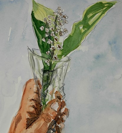
“Je porte bonheur”.. .says this little bunch of muguets(lily of the valley). A beautiful custom in France is to give a small bouquet of these to anyone and everyone you want to, on the 1st of May, that way, wishing good luck and happiness to all. Of course it is also a public holiday..worker’s day I think in English. Since I love the idea, I’m offering this bouquet of muguets to all EDM- friends – to those with special projects for May, like a drawing a day, to those who have a work on exhibit, to those who wish to exhibit, to those whom we’re voting for everyday, to those who are wonderful professional artists, to those who are doing art for the fun and joy it brings them, to those who started up this great site, to those who keep it up faithfully and in great spirit week after week, to those who add fun and joy , originality, spirit and character to this art site….to all who participate and bring beauty to look at, inspiring words to read, jokes to laugh at, advice to grow….to all at EDM; wishes of happiness to you all in this beautiful month of May!

35 comments:

น้ำธรรมดา said…
It’s very beautiful …
i like your work..
Don’t you mind if i add you to be my link.
Thank you 😉
May 1, 2007 11:30 AM  
Kunya said…
Hi Ronell, thanks… I like this idea. We have this custom in Belgium too, although I do not see this as much anymore…maybe one reason is these little flowers are far to overpriced this day. I realy like this drawing.
May 1, 2007 11:39 AM  
Laureline said…
Merci, Ronell! Et a vous, aussi, mes voeux de bonheur!
May 1, 2007 11:46 AM  
Pequete said…
Thank you Ronell, I found you through EDM and I love your work – I actually identify a lot with it, since I also love working with watercolours and ink. I’ll be visiting you often!
May 1, 2007 12:21 PM  
Lin said…
WOWZA!! What a wonderful tradition and even more glorious painting!!! THANK YOU!! You’ve begun the month in splendor!
May 1, 2007 12:31 PM  
Tonniece said…
Hi Ronell
I love this tradition, I only wish they did that here in Canada. And to make it even more special My Birthday is this mo. so THANK YOU.
As always you painting is wonderful.
May 1, 2007 1:24 PM  
Felicity said…
Beautiful painting as always Ronell, those tiny flowers look so cute! I’ve seen these lily of the valley all over the shops recently – is it the tradition to give only those? I would never have known if it wasn’t for your post, thank you. Hope you have a super day!
May 1, 2007 2:17 PM  
jill said…
beautiful work. thank you for the great way to start “may day”!
May 1, 2007 4:10 PM  
Bonny said…
Ronell, this tradition is also in parts of Italy. When my husband first began dating me, he looked through all the flower shops in the city to find me un petit bouquet de muguets. They are not usually sold in shops here in Canada. They are easier to find in the garden, but by now they are past their season here on the west coast. Thank you for such a lovely reminder of a very beautiful tradition.
May 1, 2007 4:40 PM  
Sandy said…
Thank you Ronell – I picked a sprig of Lilly of the Valley on this morning’s walk. May 1 is my grandmother’s birthday (deceased) and I have very fond memories of picking bouquets of these tiny flowers from her huge patch in her back yard AND I intended to sketch them today in her honor!! What a coincidence! I love the holiday you have attached to them and ON this date. Merci!!
May 1, 2007 6:13 PM  
Sarah said…
What a beautiful gesture – in every way!
May 1, 2007 6:15 PM  
juj said…
What a wonderful tradition and such a fabulous painting. You’ve captured them perfectly. Thank you for sharing. Sadly, I’m afraid these are the only lily of the valley I will get to see this year as ours got snapped by a late frost. Would it be possible for you to send along a little of the sweet fragrance as well?? (grin)
May 1, 2007 6:31 PM  
Ujwala said…
good luck and happiness to you too! nice to learn about different traditions and customs. great ink ‘n wash.
May 1, 2007 6:31 PM  
Deborah said…
Thank you very much! When I was a kid we always celebrated May Day, also the 1st, by picking our mothers roses and leaving flowers for all the neighbors inclucing mom of course!
May 1, 2007 6:40 PM  
Genine said…
Ronell,Beautiful drawing and a big thank you for bringing this holiday to my attention. It has definitely brightened a gray day here. I think I’ll stop on my way home and pick some up.
May 1, 2007 7:12 PM  
bec said…
Thank you Ronell!
Happy May day to you too! (that’s what we call it here in the US). Nobody gets a day off though. My lily- of-the-valley aren’t in bloom yet. They usually start blooming around mother’s day… May 13. another week or two. I always give a bouquet of them to my mother!
I like the transparent quality of your painting.Bec
May 1, 2007 7:37 PM  
Robyn said…
Beautiful idea, beautiful brushwork. Thank goodness you have sent me these, because I didn’t get any others. What have I done?!;)
May 1, 2007 8:22 PM  
Dave said…
That’s a very generous sentiment, and a lovely painting. Thank you!
May 1, 2007 9:19 PM  
Africantapestry said…
Thanks to everybody!
Ronell
May 1, 2007 9:27 PM  
Carole said…
Thank you, Ronell! And a happy May Day to you too. This is a beautiful painting and a joyful sentiment which I most wholeheartedly echo.Now then – how did you manage to hold this and paint it at the same time? 🙂
May 1, 2007 10:15 PM  
platitudinal said…
Thank you for the beautiful May Day posy, Ronell. And all the good hearted and gracious wishes that comes with it. Thank you 😉
May 2, 2007 12:01 AM  
martín said…
Ronell, there’s not much to add. The others have already said it all for me. Beautiful drawing and WCs, as always, and a REALLY BIG THANK YOU for your sincere wishes! All the best to you too.
May 2, 2007 2:38 AM  
Stacy said…
Ronell, what a lovely painting and a lovely sentiment! We don’t have this tradition in the United States. I wish we did!! I am glad I at least got to experience it here.
May 2, 2007 3:07 AM  
Linda said…
Beautiful custom and beautiful painting! You have a great sense of color and value — you always get your darks just right. And in this piece, it makes the little flowers look all the sweeter. Again, beautiful!
🙂
May 2, 2007 4:00 AM  
nik said…
Ronell, they are wonderful. We have some of them in the garden, but I did not manage to draw them. Perhaps today.
May 2, 2007 6:20 AM  
mARTa said…
I smiled this morning when i read your post and saw the lovely lilies. It’s my 31st wedding anniversary today so I tucked the tiny flowers near my heart and thought of what happiness this life has brought me. thank you for the reminder:)
May 2, 2007 7:46 AM  
caseytoussaint said…
what a nice idea, and a beautiful painting.
May 2, 2007 12:42 PM  
Ben said…
Merci beaucoup…c’est tres jolie…and thats all my five years of french have done for both of us:>
May 2, 2007 1:21 PM  
mchunt@wctel.net said…
Merci beaucoup…c’est tres jolie…and thats all my five years of french have done for both of us:
May 2, 2007 1:28 PM  
Lindsay said…
Aw,Ronell, what a lovely gift. THanks so much for the beautiful bouquet and words. Happy May 1!
May 2, 2007 3:59 PM  
phthaloblu said…
What a beautiful custom and even more beautiful sentiments! Merci beaucoup! Forgive my rusty, stunted French.
May 2, 2007 5:40 PM  
Emma Pod said…
This is a beautiful little sketch! Happy May to you and may you have a wonderful summer playing tennis!
May 2, 2007 11:43 PM  
Mommy Bee said…
Ronell,Thank you so much. Your thoughtfulness, and beautiful bouquet really touched me.As a child growing up, my mom taught my brother and I to make “May Day” baskets. We would hand make a little basket out paper and put little wild flowers in them. Then we would go ding-dong-ditch the neighbors…Leaving behind only the flower loaded basket.Thank you for the memory, and sharing your custom. Not so different from mine ;-).

May 3, 2007 8:49 PM  
suzanne said…
Thank you so much for such a beautiful sentiment! May you have a wonderful day as well.
May 4, 2007 3:08 AM  
E-J said…
And we say “thank you for the muguet” 😀 This is a lovely post, Ronell, and a lovely sketch. I am reminded of the lily-of-the-valley perfume my grandmother used to wear … I haven’t thought of it for years … thank you.

Watering cans and dainty shoes

In art class this afternoon, Casey set up a still life outside…after we enjoyed a delicious lunch of Courgette soup with sesame seeds, followed by a wonderful tomato, coriander and pine nut quiche and ended with strawberries and blood orange dessert and madeleines…I hope you are all drooling now..

It was tough getting into drawing afterwards, but we did the best we could. We had a friend there whose shoes we all admired, so she unceremoniously stacked her shoes as part of the still life….

I wanted to try a different medium today. The first one is done in a walnut stain wash and then finished off with pen and conte in different colors on Arches HP. Although not the right medium for those dainty shoes, I did it nonetheless, since I haven’t worked with it before. I do like the medium and will definitely experiment more.

_scan10031.jpg
I thought I owed it to those shoes to make them look kind of pretty, so the second is done in pen and watercolor on Arches HP. The composition is a bit off in both cases, among other things, but let’s say I felt like watching the world go by rather than joining it. (See what Judi says about this “watching the world buzz by”… http://everythingiscontextual.blogspot.com/2007/04/work-is-for-birds.html

_scan10032.jpg

Teri C said…
Well first, I am drooling reading about that wonderful lunch. Then I went right into amazement over that new paint and then into awe over those shoes!! Yo all have so much fun on your art dates!! Wish I could join you.
April 24, 2007 9:23 PM  
Lin said…
What a juxtaposition of materials –!! And yet all treated beautifully by your hand!! LOVELY LOVELY LOVELY!
April 24, 2007 9:30 PM  
Dave said…
ovely work, and what amazing shoes! That must have been a fun day.
April 24, 2007 9:44 PM  
caseytoussaint said…
Wow, that was fast! These look great. I’m really impressed with what you did with the ‘brou de noix’ I’m going to have to try that.
April 24, 2007 9:55 PM  
Lynn said…
Whoa, those shoes rock! What a happy, quirky composition this turned out to be. You did an outstanding job on both paintings.
April 24, 2007 11:50 PM  
janey said…
I like this both very much. Same scene but so different because of the color and medium. And what a neat idea to add shoes to the still life.
April 25, 2007 12:10 AM  
Lindsay said…
I like them both but I like the walnut wash one best! Gives it an air of Morrocan Mystery. And btw, you guys are having entirely TOO much fun! What foodies you are!!! Yes, I am drooling and I even just finished dinner.
April 25, 2007 1:55 AM  
Brenda Y said…
What a fabulous lunch and an even more fantastic art session. I love both of these and can’t say which I like best. I DO like the dainty shoes thrown in, they are unexpected as if they were kicked off in favor of gardening.
April 25, 2007 2:54 AM  
Nancy Van Blaricom said…
This is my first time visiting your blog and web-site and what joy it’s been. I love your watercolors and the way you use color … what a delightful touch your drawing and paintings have.
April 25, 2007 2:56 AM  
mARTa said…
well, first of all….I love the one in brou de noix best…it’s mysterious. Second…..I am thrilled that I’ll be able to share one of those wonderful meals with both of you in just a few months!
April 25, 2007 4:42 AM  
soulcomfort said…
Just wandered through your blog and love your work!! I aspire…. 🙂
April 25, 2007 5:45 AM  
platitudinal said…
I like the monochromatic look of the first painting with walnut stain. Each object seems to compliment each other and no one competes for the sole attention — even those pretty shoes in the middle. It gives a feeling of harmony.On the second painting, there’s no doubt who is the star of the picture … before I read your writing, I thought those were the sandals you use when you’re gardening. Fancy Ronell! Hehe. Bzzzzzzzz …
April 25, 2007 12:44 PM  
E-J said…
Great juxtaposition. Imagine gardening in those shoes! 🙂 Each of these is lovely in its own, quite different, way. Forgive my ignorance, but what is a walnut stain wash?
April 25, 2007 3:26 PM  
artnewbie said…
Thanks for stopping by my blog, and for your kind comments. Well, I just love these pictures, especially the dark stain one – exotic, and such fun! Diane.
April 25, 2007 7:08 PM  
suzanne said…
These are both gorgeous. I’m particularly drawn to the first one. Though the walnut wash isn’t necessarily “dainty” it realy allows the shoes to shine. You do a wonderful job of adding highlights which helps a whole lot. Oh, and your meal sounds wonderful as well…sure beats my subway sandwich!
April 25, 2007 7:51 PM  
Robyn said…
Is walnut stain what I think it is? Something one rubs into one’s skirting board! Whatever it is, is is so effective and I adore the shoes. It must be the French influence to wear such shoes to art class!
April 26, 2007 7:56 PM  
andrea joseph’s sketchblog said…
osh this whole post is just fantastic. I love the top picture Ronell – but then I am always taken by anything in sepia tones. Really stunning.
April 27, 2007 1:45 AM  
Diahn said…
Wonderful – I have to echo the others’ love of the juxtaposition of the items in the still life – and I have to envy those SHOES!!! :DIsn’t it grand to have an art buddy? Lucky you!
April 27, 2007 4:45 AM  
aPugsLife-laserone said…
REALLY beautiful pieces! I’m amazed that you used a walnut stain, it turned out incredible! 🙂
April 27, 2007 9:07 AM  
Sarah said…
i love the contrast between the delicate beaded shoes, and the watering can. This is a great image, beautifully executed. Like the sepia version too
April 27, 2007 2:52 PM  
phthaloblu said…
Those shoes are so very dainty and pretty! Nice job on both of these sketches. Thanks alot for the food cravings!
April 27, 2007 3:41 PM  
Jana Bouc said…
Wow! These are both fabulous. I love your work and woke up this morning thinking about and picturing your menu paintings from the last time I visited.

Three times different

These are the results of my drawing afternoon with Casey yesterday. I tried something different to get out of my rut and ran into all kinds of trouble. Not that I can define “something different”…

dsc_0007-2.jpg

The first one is just plain ugly and I’ve deleted it a few times from the blog, but decided finally to keep it. I wanted so many things fitted in and I chose the smallest format. I didn’t even complete it, just grabbed a brush pen and filled in some rough lines.

_scan10027.jpg

After Casey had left, I gave it another try, obstinate to get this scene in my pocket! I don’t feel much for this sketch…proportions are completely wrong, some ugly darks, even more cramped, in spite of a bigger format. Overall just a bad, disturbing painting that makes me want to come up for air.The third one I did this afternoon and decided it would be now or never. The plants need to get into the ground. I was still obstinate, so I kept to the same scene. I used an even larger format and this time I did use all the space. There is still too much detail and finicky pieces and not enough depth, but this it! I still can’t say what it is I wanted to do differently. I at least hope this last one broke my spell. 

dsc_0010.jpg

 Watercolor on Fabriano HP. See Casey’s painting from yesterday, she also tried something different…take a look http://caseytoussaint.wordpress.com/


16 comments:

Dave said…
You’re too hard on yourself! And anyway, trying something different is always with doing!
April 18, 2007 10:21 PM  
bec said…
I like the way you made the table and chair less of a focal point in the third try….it doesn’t compete for attention. I want a table and chair set like the one you painted. I bet your garden is beautiful!
April 19, 2007 1:26 AM  
Lindsay said…
I love them all! This was a hard subject and your really stuck with it. I wish I could come out with you and Casey!! Lucky you.
p.s. This is supposed to be “FUN”.
No being mean to yourself!
April 19, 2007 2:56 AM  
Brenda Y said…
Third time is the CHARM! I really like this! It’s so “SPRING.” Truly, this would look fantastic framed and hung on a sun porch. I love all the objects (particularly fond of the hat) and the pop of color from the pot of flowers is just perfect.
Thanks for posting all three! It’s really encouraging to see the progression and perseverance!!
April 19, 2007 3:21 AM  
Teri C said…
Bravo to you for your persistance. I love the third one but I also like the other ones too. It looks like a difficult subject, and I’m sure you learned a lot on the way.
April 19, 2007 4:51 AM  
caseytoussaint said…
Ronell, all three of these came out great. I don’t think the first one is ugly at all, as a matter of fact I think it’s full of charm. On the second one you’ve done an incredible job on the chair – you can just feel the texture of the metal basketweave, and the third is light and airy.
You have a distinctive style in watercolor, very elegant and yet relaxed(very French somehow) that brings to mind illustrations from the 1950s.
April 19, 2007 8:21 AM  
Carole said…
Actually, I really like the quality of the lines on the first one, and I also like the tones of the wash. The third one has a nice quality of light to it, and I love the flowers, particularly the flower on the hat. It’s a beautiful composition overall, so well done for sticking with it! I think it bore fruit, don’t you?
April 19, 2007 2:36 PM  
Sandy said…
Glorious taste of springtime, I love your work and envy you and Casey and your challenge/committment – Can’t wait to see them each week, who knows maybe I can join in some time.
April 19, 2007 8:11 PM  
platitudinal said…
What a dedicated artist you are! I love all of them. And, I’m glad you posted all of your tries. Each one has something special that the other doesn’t have.
April 20, 2007 12:35 PM  
Jana Bouc said…
Good for you to keep going until you get what you were striving for. The funny thing is that my favorite is the first one. I know it didn’t capture the look you wanted but it’s still a wonderful piece. The last one is technically better but the first one is full of energy and expressiveness somehow. They’re all worthy of appreciation though and not at all ugly!
April 20, 2007 6:06 PM  
Ujwala said…
All three are wonderful but I too especially like the first one.All the best with your new goal.
April 20, 2007 8:50 PM  
mARTa said…
well, the first one has it’s own charm, What I like about the 2nd one is the chair and compositon. The 3rd is light and airy and just as lovely.
So where is France are you and Casey? I will be in paris for 8 days in October…just roaming and skething…maybe we can meet and paint?
April 22, 2007 1:54 AM  
aPugsLife-laserone said…
These are really great! I love how determined you are. 🙂 🙂
April 22, 2007 4:21 AM  
Linda said…
Well, I love the last one, so I guess the third time is the charm, although I don’t know how you did three paintings of the same thing — all in a row! I would have been pulling my hair out!
🙂 All three have their good bits, though, as I think has been well stated by earlier commenters.
April 22, 2007 2:26 PM  
Africantapestry said…
thank you for all the comments…much apprecaited!
Ronell
April 22, 2007 4:29 PM  
phthaloblu said…
Don’t be so hard on yourself. Any time you step outside your comfort zone, you are going to be challenged. Not only on how you see your subject, but on how you interpret it also. I think these are wonderful little sketches. Keeping playing with them and something will come out of it that will satisfy you. Just remember, it’s always a learning experience.

Come on, just do it!

Five things from my bathroom. Carole said so. (http://www.carolekirk.com/ I could only get to four. I struggled almost the whole day, but I’ve done it and I feel good. Great they are not, but I’m happy. Wonderful feeling of achievement! It was so great having someone tell me: “This is what you need to do, do it” Not thinking or planning or finding something…I just did it. Next time it will be better. Thank you, Carole.

I dedicate this to all of you who were encouraging and supportive, may I do the same to you when you need it.

_scan10024.jpg

_scan10025.jpg

_scan10026.jpg

_scan10029.jpg

Pen and watercolor, Arches HP. Click on images to enlarge.

19 comments:

Dave said…
Good for you! There are some lovely touches in those sketches too. The shine on the pitcher, the shadow on the stand, etc. Enjoyed looking at them!
April 16, 2007 9:31 PM  
Claudia said…
…I like the spontaneity and freshness of the sketches!-(I’m still working on that for myself…)
April 16, 2007 9:51 PM  
Sandy said…
Fabulous, I just Love your technic, so light and fresh but with great depth and personality – GREAT!
April 16, 2007 10:05 PM  
Carole said…
Hey! Good work. I just love how you do those watercolour washes. You have such a light touch. The chair and bowl/pitcher is particularly nice. Looks like you’ve got a beautiful bathroom there!
April 16, 2007 10:37 PM  
Teri C said…
Gosh, each one is a winner! Just wonderful!
April 17, 2007 3:36 AM  
Brenda Y said…
Fantastic!! My fav is the chair with the pitcher and bowl and plant–what luscious lines and soft colors. By George, I do believe you’ve got your groove back!!
April 17, 2007 6:12 AM  
Jana Bouc said…
These all have such elegance and beauty. It looks like you’ve found your inspiration again!
April 17, 2007 7:38 AM  
MrsSnowy said…
What a spectacular comeback! My favourite is the chair with basin and pitcher. Goodness, if I tried to find inspiration in out bathroom it would spin me into instant depression – not the finest room in our house!
April 17, 2007 11:00 AM  
platitudinal said…
Wow, these are beautiful sketches. If not for the toilet paper rolls and towels sketch, I will keep on forgetting that these are paintings of your bathroom!
April 17, 2007 2:51 PM  
artnewbie said…
Lovely! What great style you have.
April 17, 2007 3:43 PM  
Lin said…
YEAH!! AND WHAT A GLORIOUS JOB YOU DID!!!!! Hope it broke your uninspired spell and that Madam Muse is sitting on your shoulder!
April 17, 2007 5:10 PM  
bec said…
I love the stuff in YOUR bathroom!
April 17, 2007 7:49 PM  
Africantapestry said…
Thank you for the comments…I am back to working, almost repeating everything twice in order to get something that is half decent, but that is OK.
Ronell
April 17, 2007 11:46 PM  
Ujwala said…
i’m away on holiday and hadnt been to your blog in a while. lots of wonderful work since I last visited and these 3 from your bathroom are super too.
April 18, 2007 6:13 AM  
E-J said…
Lovely little sketches. What an elegant bathroom you have, Ronell! Your watercolour style is very distinctive. And you’re so prolific!
April 18, 2007 12:48 PM  
caseytoussaint said…
Ronell, these are beautiful! You’ve combined your wonderful drawing skills with your decorating talent and it’s a great combination.
April 18, 2007 6:19 PM  
“Maggie” said…
Wow, the chandelier is lovely and the reflections really make this a great piece. I love all the intricate inked lines.
April 21, 2007 3:22 PM  
Africantapestry said…
thanks!
Ronell
April 22, 2007 4:30 PM  
phthaloblu said…
Once again, beautiful sketches! Love the light best of all.

Ugly, but couldn’t do without

I have found “ugly” to be an emotional concept, at least for me…
When you know the story behind it, “ugly!”, turns into “oohh how sweet!”
On a bad mood day, I see more ugly people than usual; my car is ugly, which is usually not a problem, since I couldn’t care less about a beautiful car; the dry winter scenes, which are normally architectural masterpieces, are just plain ugly and my bedroom mirror, which is most days a sweet and kind soul, shows its mean side.

Today isn’t a bad day, so I couldn’t find anything ugly around me. Even the dishwasher and washing machine, fridge…all those machine-things have their beauty today, maybe because they still do their job so dutifully?

I decided that garbage bins are my love-hate passion in life. Every day. They are not emotion-related. They are a cruel reality of life on earth. I hate every form of waste… energy, time, food, water, garbage…A Garbage bin to me, signifies the ugly side of life. But I couldn’t do without it. In shame I hang my head and I embrace my bins, glad I only have to fill them and someone else, more courageous then me, will take care of the problem elsewhere! So, here I give you the ugly side of my life and unfortunately, yours as well….

I wanted to depict these bins as ugly, so I gave only 5 minutes to myself to do each, wash included and I kept to it. I used Pentel brush pen and watercolor pencils; black….and red and green for a touch of beauty, since this isn’t a bad mood day….

_scan10022.jpg

_scan10023.jpg

Kunya said…
Nice take on the subject and I amazed what you can do in 5 min.
April 12, 2007 7:03 PM  
Lin said…
Your words are so RIGHT ON!!! And you made those can beautiful, my friend!!!! I may have to tag onto your idea … I am having a hard time with this challenge!
April 12, 2007 7:17 PM  
Sandy said…
Wow – nice sketches for 5 minutes!! Yes ugly but sentimental by necessity!!
April 12, 2007 8:36 PM  
Shirley said…
Fabulous, as always. I love this loose style.
April 12, 2007 8:53 PM  
Carole said…
Great idea for the challenge – I too am having difficulty with it. I wish I could draw this well in 5 mins! But then maybe that’s why your sketches are so alive and vibrant? I like the little touches of colour in them.
April 12, 2007 10:40 PM  
Emma Pod said…
Wonderful choice of an “ugly” item. I agree with you about mood and ugliness….they do tend to go together. I like the gray tones in these drawing and the touches of color add something nice. You are right about the existential ickiness of garbage/waste.
April 13, 2007 1:28 AM  
platitudinal said…
Ronell, I like what you wrote about this ‘ugly’ theme. I appreciate your honesty when you admit you see more ugly people when you are in the bad mood. I see your perspective of the trash bin as a symbol of waste and how it pertains to our life.Thank you for the thoughtful post and the accompanying pictures. You tried to portray ugly, but you couldn’t help bringing some element of beauty in it … like the brilliant red of the trash bag tie, and the lush green foliage that slipped quietly in the corner.
April 13, 2007 4:50 AM  
Brenda Y said…
This post needs to be published! What a wonderful take on “trash to treasure!” You’ve made waste beautiful and given us so much to ponder as far as how our moods effect our outlook. Thanks!
April 13, 2007 6:00 AM  
caseytoussaint said…
I thoroughly agree with everyone’s comments – this is a wonderful post, and you’ve made charming drawings out of a rather un-lovely object. I just love the touch of color. Beautiful work, Ronell.
April 13, 2007 8:16 AM  
Africantapestry said…
Thank you for the comments, everyone.
While I was doing this post, I thought how I would enjoy doing more “important”(by lack of better description) art, not pretty pictures, but art that touches, rises questions, thoughts, discussion, even controversy…but to do that, you have to be brave and a bit careless, I think, not worrying about hurting feelings all the time, like I do!
I am working on that though, searching for how I can say something important with my brush…
thanks
Ronell
April 13, 2007 8:23 AM  
Deb Salter said…
I really liked your thoughts on ‘ugly’! And your drawings are amazing, I hope it doesn’t spoil it, but they’re really attractive bins!
April 13, 2007 2:10 PM  
Anonymous said…
Hello. These are incredible, great obervation and take on the challenge!
Patty
April 13, 2007 3:46 PM  
bec said…
I so agree with your ideas about this challenge–I’m having such a hard time finding something “ugly” to draw. Your trash cans are beautiful!
Bec
April 13, 2007 5:16 PM  
Silvia said…
Really wonderful idea on “something ugly”. :)!!
April 13, 2007 9:13 PM  
MrsSnowy said…
You get no points for Ugly because, as has been noted, you’ve made your trash cans beautiful! I love that tone and the character in your lines! You do get a star though, for a great post. 🙂
April 14, 2007 6:44 PM  
SCquiltaddict said…
TOOO funny and what a great job with a great idea!
April 15, 2007 1:30 AM  
nita said…
Great interpretation of the theme and excellent sketches for the limited time allocation. Love those little hints of colour.
April 15, 2007 5:35 PM  
Africantapestry said…
Thank you for all the kind comments.
Ronell
April 15, 2007 6:04 PM  
phthaloblu said…
Nice choice for the theme. I, too, hate wastefulness of any kind, and I think it’s worse when you can SEE it. 5 minutes? Wow, I am amazed what can be achieved in that amount of time. Well done!
April 16, 2007 4:23 AM  
Teri C said…
it’s perfect for ugly and sooooo well done.Love your little quick sketches also.

Spot the differences

Play along and spot the differences between the two pictures.

difference-1.jpg

Stand on your head to read the answer at the bottom.

difference-2.jpg

casey said…
My, you are productive! I really like this one too. I’m running out of adjectives here!
March 25, 2007 5:43 PM  
Teri C said…
Good thing I have a laptop:) because the only difference I see is the lighter one on the bottom.Wonderful painting!!
March 25, 2007 7:18 PM  
Lin said…
I must be blind but I don’t see a difference — but I LOVE the sketch!!!
March 25, 2007 8:03 PM  
aPugsLife-laserone said…
I can’t see any differences, but I’m not awake, LOL! But I do love the painting! 🙂
March 25, 2007 9:04 PM  
🙂 Silvia said…
There are 7 differences??? My oh my… and I am only able to spot 2 of them…
What a creative idea :)!
March 25, 2007 9:41 PM  
Ujwala said…
Spotted 2 too and if you’re counting the colour difference then one more 😀 neat idea for the ilo.
March 26, 2007 6:01 AM  
Africantapestry said…
Hi everybody…thanks for the comments and playing along…there are really 7 differences(lines), maybe a bit more subtle than expected..it is actually hard to see on the small image and not easy to flick between the two images..but thanks, it is more about the idea anyway.
ronell
March 26, 2007 8:20 AM  
phthaloblu said…
This is such a cool idea. And the paintings are wonderful even tho I can’t see the differences.
March 26, 2007 2:45 PM  
Fanta said…
I only spotted three differences.
Thanks for commenting on my blog, your works are wonderful, and so glad I found you through Casey’s blog.
March 28, 2007 11:40 PM  
MrsSnowy said…
Wow – there is so much that pleases me here. First of all, I love the simple but so effective style of this sketch – now I’m going to bookmark your blog and enjoy it when I’ve done some housework! ciao Robyn
March 29, 2007 1:16 PM  
Carole said…
Well, I found 3 plus the colour difference! Lovely paintings. I like your pen and wash of the fisherman too.
March 29, 2007 7:49 PM  
Africantapestry said…
Again, thank you for the wonderful words, everybody, I really apprecite it!
Ronell
March 30, 2007 12:37 AM  
Marilyn said…
 really don’t see any differences. See, we always see our own “differences” and think everyone else sees them.
I love your blog. You’ve done some mighty fine art.