Watering cans and dainty shoes

In art class this afternoon, Casey set up a still life outside…after we enjoyed a delicious lunch of Courgette soup with sesame seeds, followed by a wonderful tomato, coriander and pine nut quiche and ended with strawberries and blood orange dessert and madeleines…I hope you are all drooling now..

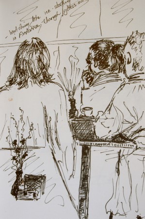
It was tough getting into drawing afterwards, but we did the best we could. We had a friend there whose shoes we all admired, so she unceremoniously stacked her shoes as part of the still life….

I wanted to try a different medium today. The first one is done in a walnut stain wash and then finished off with pen and conte in different colors on Arches HP. Although not the right medium for those dainty shoes, I did it nonetheless, since I haven’t worked with it before. I do like the medium and will definitely experiment more.

_scan10031.jpg
I thought I owed it to those shoes to make them look kind of pretty, so the second is done in pen and watercolor on Arches HP. The composition is a bit off in both cases, among other things, but let’s say I felt like watching the world go by rather than joining it. (See what Judi says about this “watching the world buzz by”… http://everythingiscontextual.blogspot.com/2007/04/work-is-for-birds.html

_scan10032.jpg

Teri C said…
Well first, I am drooling reading about that wonderful lunch. Then I went right into amazement over that new paint and then into awe over those shoes!! Yo all have so much fun on your art dates!! Wish I could join you.
April 24, 2007 9:23 PM  
Lin said…
What a juxtaposition of materials –!! And yet all treated beautifully by your hand!! LOVELY LOVELY LOVELY!
April 24, 2007 9:30 PM  
Dave said…
ovely work, and what amazing shoes! That must have been a fun day.
April 24, 2007 9:44 PM  
caseytoussaint said…
Wow, that was fast! These look great. I’m really impressed with what you did with the ‘brou de noix’ I’m going to have to try that.
April 24, 2007 9:55 PM  
Lynn said…
Whoa, those shoes rock! What a happy, quirky composition this turned out to be. You did an outstanding job on both paintings.
April 24, 2007 11:50 PM  
janey said…
I like this both very much. Same scene but so different because of the color and medium. And what a neat idea to add shoes to the still life.
April 25, 2007 12:10 AM  
Lindsay said…
I like them both but I like the walnut wash one best! Gives it an air of Morrocan Mystery. And btw, you guys are having entirely TOO much fun! What foodies you are!!! Yes, I am drooling and I even just finished dinner.
April 25, 2007 1:55 AM  
Brenda Y said…
What a fabulous lunch and an even more fantastic art session. I love both of these and can’t say which I like best. I DO like the dainty shoes thrown in, they are unexpected as if they were kicked off in favor of gardening.
April 25, 2007 2:54 AM  
Nancy Van Blaricom said…
This is my first time visiting your blog and web-site and what joy it’s been. I love your watercolors and the way you use color … what a delightful touch your drawing and paintings have.
April 25, 2007 2:56 AM  
mARTa said…
well, first of all….I love the one in brou de noix best…it’s mysterious. Second…..I am thrilled that I’ll be able to share one of those wonderful meals with both of you in just a few months!
April 25, 2007 4:42 AM  
soulcomfort said…
Just wandered through your blog and love your work!! I aspire…. 🙂
April 25, 2007 5:45 AM  
platitudinal said…
I like the monochromatic look of the first painting with walnut stain. Each object seems to compliment each other and no one competes for the sole attention — even those pretty shoes in the middle. It gives a feeling of harmony.On the second painting, there’s no doubt who is the star of the picture … before I read your writing, I thought those were the sandals you use when you’re gardening. Fancy Ronell! Hehe. Bzzzzzzzz …
April 25, 2007 12:44 PM  
E-J said…
Great juxtaposition. Imagine gardening in those shoes! 🙂 Each of these is lovely in its own, quite different, way. Forgive my ignorance, but what is a walnut stain wash?
April 25, 2007 3:26 PM  
artnewbie said…
Thanks for stopping by my blog, and for your kind comments. Well, I just love these pictures, especially the dark stain one – exotic, and such fun! Diane.
April 25, 2007 7:08 PM  
suzanne said…
These are both gorgeous. I’m particularly drawn to the first one. Though the walnut wash isn’t necessarily “dainty” it realy allows the shoes to shine. You do a wonderful job of adding highlights which helps a whole lot. Oh, and your meal sounds wonderful as well…sure beats my subway sandwich!
April 25, 2007 7:51 PM  
Robyn said…
Is walnut stain what I think it is? Something one rubs into one’s skirting board! Whatever it is, is is so effective and I adore the shoes. It must be the French influence to wear such shoes to art class!
April 26, 2007 7:56 PM  
andrea joseph’s sketchblog said…
osh this whole post is just fantastic. I love the top picture Ronell – but then I am always taken by anything in sepia tones. Really stunning.
April 27, 2007 1:45 AM  
Diahn said…
Wonderful – I have to echo the others’ love of the juxtaposition of the items in the still life – and I have to envy those SHOES!!! :DIsn’t it grand to have an art buddy? Lucky you!
April 27, 2007 4:45 AM  
aPugsLife-laserone said…
REALLY beautiful pieces! I’m amazed that you used a walnut stain, it turned out incredible! 🙂
April 27, 2007 9:07 AM  
Sarah said…
i love the contrast between the delicate beaded shoes, and the watering can. This is a great image, beautifully executed. Like the sepia version too
April 27, 2007 2:52 PM  
phthaloblu said…
Those shoes are so very dainty and pretty! Nice job on both of these sketches. Thanks alot for the food cravings!
April 27, 2007 3:41 PM  
Jana Bouc said…
Wow! These are both fabulous. I love your work and woke up this morning thinking about and picturing your menu paintings from the last time I visited.

The details of a wisteria

The wisterias are magnificent now, their beauty cascading over walls and pergolas and trees and gates, windows and towers, roofs and even pathways. I just had to take on a painting or two, try and capture a little of their glory.

I tried twice again, not being too happy with the first try. I took on another corner, more “architectural”, more detailed, brighter colors, with which I am quite content..it feels like “me”.

dsc_0003-4.jpg

And I just can’t get away from it- detail- I need detail. Without it, I can’t stress. I can’t be obsessive compulsive. Without detail in my life, I can’t experience beauty. I can’t create beauty. Without detail, life is very foggy and leaves only an impression of what might be out there…very much like the first painting of these wisterias.

dsc_0011-3.jpg

Watercolor and ink on Arches HP
23 x 31cm (9″ x 12″)


14 comments:

Fanta said…
Wonderful again, Ronell. I love the way the shadows “dance” on the wall surface created by your careful layering, especially in the first one.
Have a great Sunday!
April 22, 2007 2:01 PM  
Lindsay said…
I like how you do these a couple of times! Lovely job.
I’ve been trying to get my wisteris to bloom for YEARS. Stubborn things refuse to flower.
April 22, 2007 5:14 PM  
Teri C said…
You are persistant arn’t you! The signs of a good detail person….I recognize it because that’s me too.Those wisteria are wonderfu and beautiful. So glad you persisted to your satisfaction.BTW, I was just reading about creativity and a detail person is called “bios’ or the dteails of life, and the person that has an overview of things is called ‘zoe’ or the essence of life.

Hmm, I bet that is more information than you wanted! 🙂

April 22, 2007 6:43 PM  
Lin said…
GORGEOUS GORGEOUS GORGEOUS!!!! The frost nipped ours and I haven’t seen much since then — so I am thoroughly enjoying yours!! Did you know you can eat the flowers?? BUT ABSOLUTELY NOT THE SEEDS!!
April 22, 2007 11:13 PM  
Lin said…
PS — I’M RIGHT THERE WITH YOU AND DETAIL … MAKES ME SO UNCOMFORTABLE WHEN I LEAVE IT OUT!!! Hard to learn to live with simlicity — i do love the detail!!! lol
April 22, 2007 11:14 PM  
Dave said…
I love wisteria, and you’ve really captured it in these lovely pictures!
April 22, 2007 11:36 PM  
beautiful! i LOVE wisteria and the draping laziness of it. great pictures!
April 23, 2007 1:59 AM  
Nancy said…
Love the wisteria – I, too, have been trying to get mine to bloom – they are 9 years old now. Is there any hope?These a gorgeous!
April 23, 2007 5:13 AM  
aPugsLife-laserone said…
Oh my gosh, I just love these! My favorite is the first one. I’m such a sucker for blue. Very beautiful! 🙂
April 23, 2007 9:26 AM  
caseytoussaint said…
These are both beautiful, but the second one does more to convey the delicacy of wisteria – such a tough subject.
April 23, 2007 10:59 AM  
Sandy said…
I love Wisteria and mine is huge, but never blooms !!!!! I want to paint them too!!! Just Lovely! You have been busy!
April 23, 2007 5:07 PM  
Carole said…
I’m another wisteria fan, and I agree that you’ve really got the essence of wisteria in this second painting. The twisted branches and those wonderful long cascades of blue/lilac flowers. I once painted the detail of just one of those tiny little flowers – I may post it on my blog.
April 23, 2007 10:55 PM  
phthaloblu said…
I understand all about detail. Yep! As much as I try to get away from it, I am only happy when it looks like what I’m looking at. These are both so beautiful. I love wisteria, too, the way it hangs and looks. It’s all around my house, but not in my yard. Wonderfully done.
April 24, 2007 3:15 PM  
platitudinal said…
Thank you for your unrelenting pursue of details, we all benefit from it and get to enjoy the beauty you created based from your search.*Honestly speaking, though, Ronell, I think both takes of the wisterias are appealing. 🙂

Three apples and the rest

Voila my painting of the week – a bowl with fruit.

It took 3 apples to get to the “right” half eaten one.
The first one was so crunchy and sweet and just too delicious, I ate the whole thing. That made me full. I then asked Hartman to eat the second one with specific orders…he just gave 3 huge gulps and only the stem was left…a little bit of deliberation there. There was only one left, so I had to eat the third apple carefully, measuring it against the other three after each bite. And then we went to play tennis. When I got back, the apple turned all brown. I had no apples left. So I played guessing game on the color.

The bowl is made by the artist Carrol Boyes from SA. Using pewter and other materials she makes beautiful bowls and cutlery and office stuff and…and…. to see
her work, which can also be ordered online – www.carrolboyes.com

I love expressionism. I find I can achieve that in oil, a little more challenging in watercolor though. I have a fear of losing the transparency of watercolor….but I think this one isn’t that far off?

dsc_0004-5.jpg

Brenda Y said…
Oh, this is marvelous! Definitely you’ve kept the transparency. Gorgeous lights and luscious shadows and a very lovely palette – I like the one green apple, really adds a punch to the trio in the dish. The dish. . . just gorgeous, it absolutely looks like pewter!!
April 21, 2007 7:52 PM  
SCquiltaddict said…
Oh goodness this one is lovely…such a great wc….
April 21, 2007 8:51 PM  
Carole said…
I love what you do with watercolour paint! This is a lovely composition (great bowl!) and the colours simply sing from the page. I like the loose shadow and background, and the way you’ve got the detail of the eaten apple. It’s just so funny that the pair of you nearly ate the still life before you could paint it!
April 21, 2007 9:34 PM  
Felicity said…
Just fabulous! So lovely and loose and those lights just make it zing!
April 21, 2007 9:39 PM  
Teri C said…
Wow, these are wonderful! The colors, reflections and the compostion. I laughed when I read your dilemna of eating all the apples and no wonder, they look so good.
April 21, 2007 10:07 PM  
Fanta said…
Simply stunning, Ronell!
April 21, 2007 10:21 PM  
why said…
i like this one a lot too… the colors, the reflections and the shadows.. great work!
April 22, 2007 12:09 AM  
Lin said…
Ronell — you have such an easy going, painterly gorgeous style — I LOVE IT — and these fruits are delicious looking and spectacular!
April 22, 2007 12:22 AM  
mARTa said…
What beautiful colors, reflections…the apples look so juicy! lovely!
April 22, 2007 1:52 AM  
janeysjournal@aol.com said…
What a lovely little painting. Those highlights just sparkle.
April 22, 2007 3:54 AM  
aPugsLife-laserone said…
Fantastic! I love that there’s an eaten apple in there. 🙂
April 22, 2007 4:21 AM  
martín said…
Ronell, this is just beautiful! i do love this work!!!! greetings.
April 22, 2007 4:52 AM  
Karen said…
very well done Ronell
April 22, 2007 8:23 AM  
Tonniece said…
Hi Ronell
Thought I’d come out of the woodwork.
I love this piece and the great story behind it also. Great blog here, I visit often.
Thanks for visiting mine and for the nice comment on my.
April 22, 2007 1:11 PM  
Linda said…
GREAT piece! It’s just too bad that you had to go through all that trauma of eating apples to get to this point, but we must suffer at times for our work, mustn’t we?! 😉 The colors are marvellous — very transparent and with juicy brushstrokes. This is a keeper!
April 22, 2007 2:28 PM  
E-J said…
What an unusual bowl! There’s a wonderful fresh, transparent look to this. And I think the half-eaten apple’s the best part 🙂
April 22, 2007 3:24 PM  
Africantapestry said…
Thank you for taking the time to look and comment…I appreciate it!
Ronell
April 22, 2007 4:28 PM  
caseytoussaint said…
Ronell, I’m so far behind! My preview button kept showing the same old post – now I know notto trust it! Lovely job on this, it really just glows. This is the effect I keep trying to get – and you do it so effortlessly.
April 23, 2007 10:57 AM  
Robyn Sinclair said…
Luscious, loose and very much back to your old form I see. Just gorgeous! I’ve missed a whole lot of posts too!
April 23, 2007 11:22 AM  
Christeen said…
You are, aparently, a master of the color guessing game- this is a delightful painting 🙂
April 23, 2007 5:10 PM  
phthaloblu said…
Sacrificing the body, or in this case the stomach, for your art. Well done!
April 24, 2007 3:17 PM  
platitudinal said…
“It took 3 apples to get to the ‘right’ half eaten one” — Shucks, Ronell, I think I need to start drawing something that I can eat too. Hmm … should I start with subject like a half eaten cake? I wonder how many pieces I need to eat before I get the perfect half eaten look. (Sigh) Things that we must do for art’s sake!“Have to guess the colors.” Wow, they look really good, Ronell! Those apples, and the perfectly half eaten one, look so luscious and delicious!

Ugly, but couldn’t do without

I have found “ugly” to be an emotional concept, at least for me…
When you know the story behind it, “ugly!”, turns into “oohh how sweet!”
On a bad mood day, I see more ugly people than usual; my car is ugly, which is usually not a problem, since I couldn’t care less about a beautiful car; the dry winter scenes, which are normally architectural masterpieces, are just plain ugly and my bedroom mirror, which is most days a sweet and kind soul, shows its mean side.

Today isn’t a bad day, so I couldn’t find anything ugly around me. Even the dishwasher and washing machine, fridge…all those machine-things have their beauty today, maybe because they still do their job so dutifully?

I decided that garbage bins are my love-hate passion in life. Every day. They are not emotion-related. They are a cruel reality of life on earth. I hate every form of waste… energy, time, food, water, garbage…A Garbage bin to me, signifies the ugly side of life. But I couldn’t do without it. In shame I hang my head and I embrace my bins, glad I only have to fill them and someone else, more courageous then me, will take care of the problem elsewhere! So, here I give you the ugly side of my life and unfortunately, yours as well….

I wanted to depict these bins as ugly, so I gave only 5 minutes to myself to do each, wash included and I kept to it. I used Pentel brush pen and watercolor pencils; black….and red and green for a touch of beauty, since this isn’t a bad mood day….

_scan10022.jpg

_scan10023.jpg

Kunya said…
Nice take on the subject and I amazed what you can do in 5 min.
April 12, 2007 7:03 PM  
Lin said…
Your words are so RIGHT ON!!! And you made those can beautiful, my friend!!!! I may have to tag onto your idea … I am having a hard time with this challenge!
April 12, 2007 7:17 PM  
Sandy said…
Wow – nice sketches for 5 minutes!! Yes ugly but sentimental by necessity!!
April 12, 2007 8:36 PM  
Shirley said…
Fabulous, as always. I love this loose style.
April 12, 2007 8:53 PM  
Carole said…
Great idea for the challenge – I too am having difficulty with it. I wish I could draw this well in 5 mins! But then maybe that’s why your sketches are so alive and vibrant? I like the little touches of colour in them.
April 12, 2007 10:40 PM  
Emma Pod said…
Wonderful choice of an “ugly” item. I agree with you about mood and ugliness….they do tend to go together. I like the gray tones in these drawing and the touches of color add something nice. You are right about the existential ickiness of garbage/waste.
April 13, 2007 1:28 AM  
platitudinal said…
Ronell, I like what you wrote about this ‘ugly’ theme. I appreciate your honesty when you admit you see more ugly people when you are in the bad mood. I see your perspective of the trash bin as a symbol of waste and how it pertains to our life.Thank you for the thoughtful post and the accompanying pictures. You tried to portray ugly, but you couldn’t help bringing some element of beauty in it … like the brilliant red of the trash bag tie, and the lush green foliage that slipped quietly in the corner.
April 13, 2007 4:50 AM  
Brenda Y said…
This post needs to be published! What a wonderful take on “trash to treasure!” You’ve made waste beautiful and given us so much to ponder as far as how our moods effect our outlook. Thanks!
April 13, 2007 6:00 AM  
caseytoussaint said…
I thoroughly agree with everyone’s comments – this is a wonderful post, and you’ve made charming drawings out of a rather un-lovely object. I just love the touch of color. Beautiful work, Ronell.
April 13, 2007 8:16 AM  
Africantapestry said…
Thank you for the comments, everyone.
While I was doing this post, I thought how I would enjoy doing more “important”(by lack of better description) art, not pretty pictures, but art that touches, rises questions, thoughts, discussion, even controversy…but to do that, you have to be brave and a bit careless, I think, not worrying about hurting feelings all the time, like I do!
I am working on that though, searching for how I can say something important with my brush…
thanks
Ronell
April 13, 2007 8:23 AM  
Deb Salter said…
I really liked your thoughts on ‘ugly’! And your drawings are amazing, I hope it doesn’t spoil it, but they’re really attractive bins!
April 13, 2007 2:10 PM  
Anonymous said…
Hello. These are incredible, great obervation and take on the challenge!
Patty
April 13, 2007 3:46 PM  
bec said…
I so agree with your ideas about this challenge–I’m having such a hard time finding something “ugly” to draw. Your trash cans are beautiful!
Bec
April 13, 2007 5:16 PM  
Silvia said…
Really wonderful idea on “something ugly”. :)!!
April 13, 2007 9:13 PM  
MrsSnowy said…
You get no points for Ugly because, as has been noted, you’ve made your trash cans beautiful! I love that tone and the character in your lines! You do get a star though, for a great post. 🙂
April 14, 2007 6:44 PM  
SCquiltaddict said…
TOOO funny and what a great job with a great idea!
April 15, 2007 1:30 AM  
nita said…
Great interpretation of the theme and excellent sketches for the limited time allocation. Love those little hints of colour.
April 15, 2007 5:35 PM  
Africantapestry said…
Thank you for all the kind comments.
Ronell
April 15, 2007 6:04 PM  
phthaloblu said…
Nice choice for the theme. I, too, hate wastefulness of any kind, and I think it’s worse when you can SEE it. 5 minutes? Wow, I am amazed what can be achieved in that amount of time. Well done!
April 16, 2007 4:23 AM  
Teri C said…
it’s perfect for ugly and sooooo well done.Love your little quick sketches also.

I would simply have to snap my finger and…

…. strawberries would always be in season…

_scan10011.jpg

 ….chocolates would never make you fat…

_scan10001.jpg

 ….aspararagus would be available all year round….

_scan10012.jpg

…. onions wouldn’t give you a smelly breath…

red-onions.jpg

 ….coffee would be considered a health food…

dsc_0023-2.jpg

 ….my purse would always have money in it…

….my house could self-clean by the push of a button…

….I would have a chauffeur to drive me where I want….

….I would never again have to fly economy class…

In a perfect world, I suppose I would never have to snap my finger…

🙂 Silvia said…
Great ideas – and wonderful paintings!
April 2, 2007 5:30 PM  
jill said…
i am right there w/ you on these things. way to go! great way to look at the challenge and achieve!
April 2, 2007 5:48 PM  
platitudinal said…
Oh, Ronell, I pray for your perfect world to materialize. Then, I’ll come a knockin’ and a beggin’ for you to let me in. Everything look so delicious, even the onion! Superb paintings.~Luci.
April 2, 2007 5:54 PM  
Carole said…
What lovely loose watercolour illustrations! I like your perfect world, too.Those lifedrawings are impressive as well. Your lines are so sure and cleanly drawn. Must take years of practice to achieve.
April 2, 2007 6:47 PM  
Teri C said…
WONDERFUL!!! I love every painting and every word you said!! Ronell for President!!
April 2, 2007 7:07 PM  
nik said…
Ronell, your paintings are fantastic. I love the box of strawberries. What watercolor brand do you use?
April 2, 2007 7:07 PM  
Lin said…
OH MY GOSH!!! I SO AGREE — AND TO ADD TO THIS FANTASTIC SNAPPING OF WISHES — I’D ADD — TO SKETCH AND PAINT AS WONDERFUL AS YOU!!! GLORIOUS SKETCHES!!!!
April 2, 2007 7:11 PM  
MrsSnowy said…
Oh, I wish these were mine! Fantastic – and the final tea is just beautiful, Ronell.
April 2, 2007 8:53 PM  
MrsSnowy said…
Sorry! It was coffee not tea. And I agree about economy class travel – from Italy to Australia is about as bad as it can get!
April 2, 2007 8:55 PM  
caseytoussaint said…
What a great post, Ronell! I agree with you about everything, and these paintings are really marvelous.
April 2, 2007 9:00 PM  
Africantapestry said…
Thank you for all the lovely comments, everybody..
Nik, I’m almost embarressed to confess – I don’t have a specific brand of watercolor…I use everything that is on the market, so I have half pans and tubes and full pans of this and that and there isn’t one that I can say I truly don’t like or particularly prefer. When a color is finished, I just replace it by whatever I feel like buying when I’m in the store…not very artist-like, I suppose, sorry..!I do favor Arches and Fabriano papers though.
You are actully spot on, Robyn, it is Rooibosch tea in the last image(which is ironically, a very healthy tea!!) but I was too lazy to draw the coffee and I WANTED coffee on the list, so I just used this image…forgive me for cheating there!
Ronell
April 2, 2007 10:45 PM  
gabi campanario said…
very clever concept for ‘snap’ and great watercolors, love the light and brightness of the strawberries
April 2, 2007 10:56 PM  
Emma Pod said…
Really wonderful paintings! I especially like the asparagus. I love your ideas…could we have someone do our exercises for us too??
April 2, 2007 11:36 PM  
Kristin Saegaert said…
I’m all for the self cleaning house! And I love your illustrations – wonderful watercolors and drawings! Very interesting – every one of them! Thanks for sharing your creativity!
April 2, 2007 11:36 PM  
Alison said…
This is a lovely set – great idea for the topic. An inspiring blog.
April 3, 2007 1:11 AM  
Felicity said…
Beautiful paintings! So lovely and juicy looking!Can you read my mind – this could almost be my list! And is that Lindt chocolate?
April 3, 2007 9:46 AM  
why said…
these are beautiful!!
April 3, 2007 4:15 PM  
Sandy said…
Oh – Please let it be so!!!! Great post and I love your whole blog!!
April 3, 2007 5:22 PM  
martha said…
….and I could spend all day sketching! Wonderful drawings; you have a great touch with watercolor.
April 3, 2007 10:08 PM  
Susan Cornelis said…
Oh! You’re making me so hungry. I think you’ve manifested the perfect world by painting it.
April 3, 2007 10:41 PM  
Peceli and Wendy’s Blog said…
Discovered your blog today. What a prolific artist you are – with such fresh paintings of everyday subjects and your life drawings are so animated with great poses.
Lovely work.
w.
April 4, 2007 3:32 AM  
Africantapestry said…
Thank you for the lovely comments everybody, once again, I appreciate the time you take to comment here. Thanks
Ronell
April 4, 2007 9:08 PM  
Jana Bouc said…
Spectacular. I’m just loving these collections of words and pictures. Great work!
April 6, 2007 7:39 AM  
andrea joseph’s sketchblog said…
Wow Ronell,
these are absolutely stunning. I’m in awe. The lovely loose style, the colours are fantastic – just all of it really!
My own favourites; the onions, I just love the way you can almost feel that papery skin, amazing. The bottom one is just brilliant too, as well as the asparagus……
April 6, 2007 11:25 AM  
ksklein said…
May I join your perfect world? 🙂

Ink sketches – people

We went to Andorra for a week of snow and ski recently. No skiing though, since there wasn’t any snow except for that made by snow canons. The girls did ski, but H(love of my life) and I passed on that one, so we did a lot of other sightseeing. One thing we did frequently, was going to the sportcentre where H could make use of WiFi available. It may sound like he is a workaholic, but he is as passionate about what he does in life as I am about doing my art. He loves his job, so his computer and notebook and pen and paper go with him, like my stuff travels with me. So, while he “WiFis and calculates and designs, I draw and write and read and watch the world go by and of course, we enjoy a cuppachino or two. The spoet centre was a great place – a big complex with indoor pools, ice skating rink, tennis courts…and a cafeteria. I did these drawings while having our coffee. The first sketch is the “food corner” in the house we stayed in.


5 comments:

Cavalera said…
very nice sketches, keep up the good work
February 8, 2007 8:32 PM  
ksklein said…
hey, these sketches are great.
February 8, 2007 9:10 PM  
Casey said…
what a great window onto your vacation! Much more fun than photos. Nice, Ronell.
February 8, 2007 9:45 PM  
aPugsLife said…
I really like these! 🙂
February 10, 2007 4:51 AM  
andrea joseph’s sketchblog said…
These are really great – and I especially love the top one!