I have been asked so many times how I do my splashes and after another request from Sophia, I thought I could do a pôst to explain how I splash ans splotch. have forever been doing splashes in my watercolor paintings and sketches. I paint and sketch with a big brush and loads of pigment and water and the splashes almost happen all by itself on my page. There are times though that I use splashes to emphasize or create a certain effect or atmosphere. It all depends on the sketch or painting. I notice that it has become very fashionable in the sketching world to use splashes which is great. But sometimes a sketch can look out of sorts with splashes, which either don’t fit the style of painting or the subject doesn’t ask for splashes, and so it appears on sketches just because it is fashionable. I love my splashes, but I don’t use them every time and with every subject. I would like to see that watercolor work show more discretion when using splashes, before it ruins an already perfect watercolour painting or sketch.
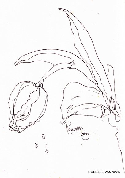
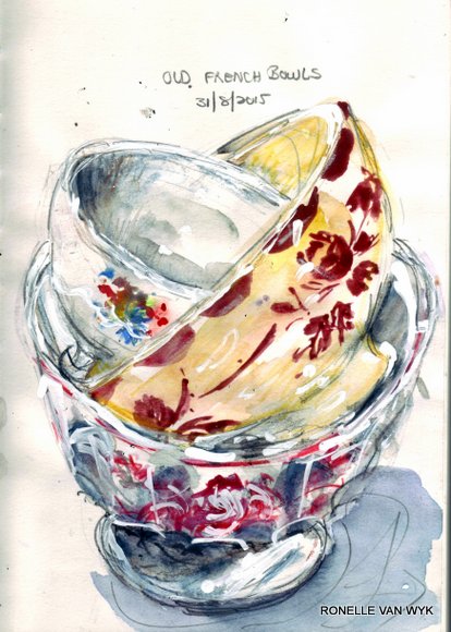
Old french bowls 1…without any splashes. This sketch was done using watercolor, watercolorpencils and white gouache. I overworked the sketch somewhat, so the bottom bowl started losing its shape.
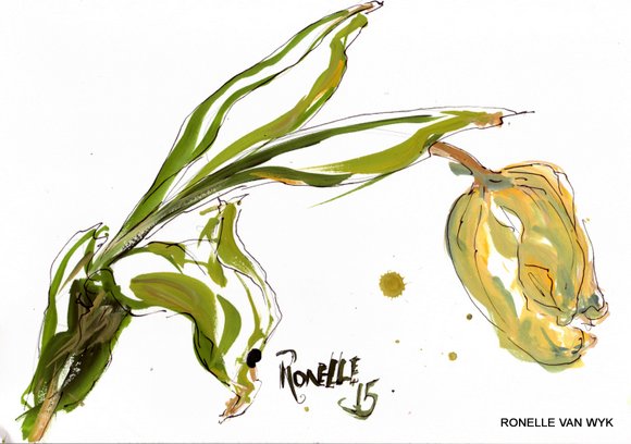
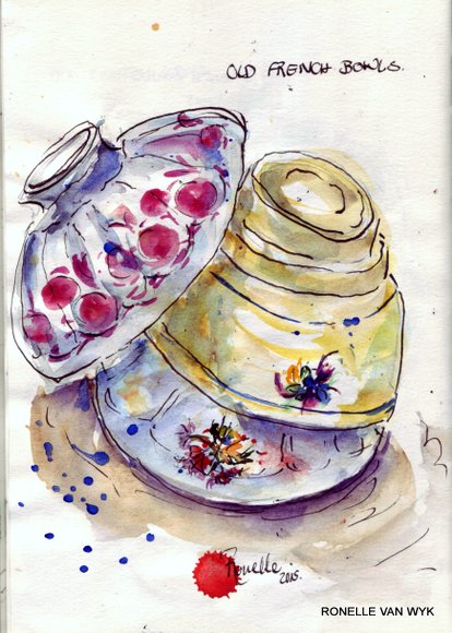
Old French bowls 2, without any splashes. Mixed media – watercolour, watercolour pencils and white gouache.
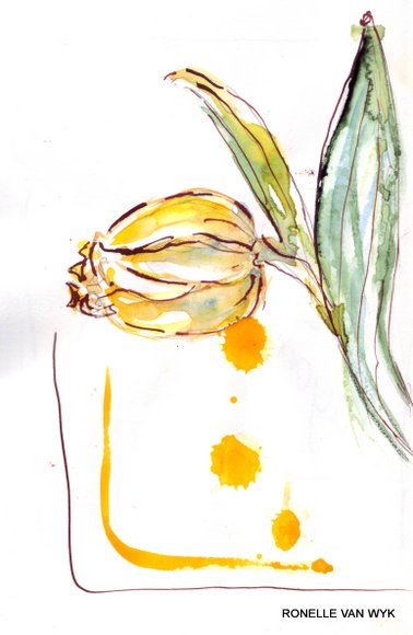
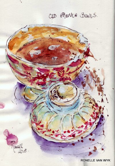
Old french bowls 3, with blue splotches and 1 red splash which I added simply to “accompany” my signing). I used only watercolour and pen for this sketch
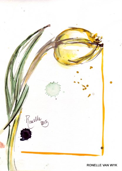
Old french bowls 4, with brown spatters on the right side, dark red splotches at the bottom and 1 lilac splash(for my name). In my opinion, on this sketch, less spattering or even none would have been fine, I added the spatters etc for demonstration.
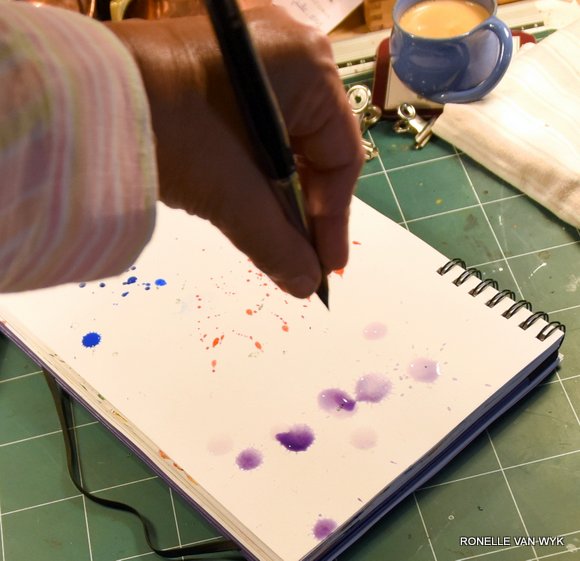
When working in watercolor, I use only one brush, usually my Rosemary sable 12. My splashes are done right at the end with the same brush. Depending on the subject and the atmosphere I want to add to my sketch/painting, I choose from 3 different types of splashes. I call them for my own use, splashes, splotches and spatters.
*Splotches are the small, smaller then the splashes, but bigger, but bigger than the small spatters. To get these dropletys, I load my brush a fair amount of water and colour and hold the brush up straight while I shake the brush in quick upward and downward movements to release the droplets.

*Spatters are those tiny droplets that sometime happen a line or a curve. I get them by loading my brush with not too much water and then flick my finger on the brush to spatter the colour, which most of the time, are small droplets which end up in a line on the paper.
 Splashes are the large round drops dropped from a high distance above the paper. I fill the brush with color and water, stand up over the paper to keep my eye on the spot I want to drop a splash and press the brush at the tip to form a drop which splashes on the paper.
 I have chosen some of my sketches to show the effect of leaving out splashes or adding them.
To illustrate some of my splashes and splotches etc, here are some of my previous work.
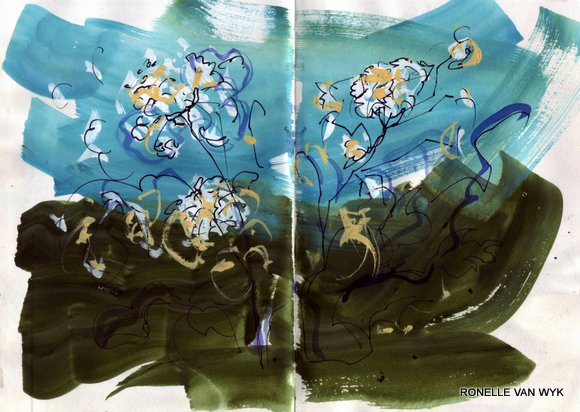
Two Siberian iris sketches – Left: Only 2 big splashes. The line work and minimalist appearance of the sketch doesn’t welcome tiny spatters of colour, it would only distract. Right: The more loose watery interpretation allows for some large splashes as well as some spattering. It adds to a frivolous interpretation and could suggest picking of the irises, blowing in the wind, petals falling…movement.


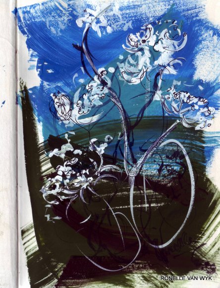
Some more examples of where splashes work and where not:
In the bottom sketch, splashes don’t belong..it is already a very busy sketch with lots of information.

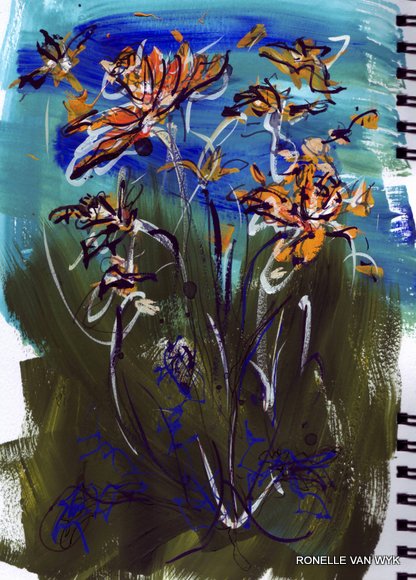
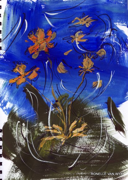
The sunflower just asks for some splattering…suggesting bees working, pollen blowing in the wind, petals falling off… movement.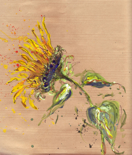 In the sketch below, I used only a green splash and blue splotches to suggest sky and leaves and I like the effect of stark lines with the contrasting wild bursts of colour.

I hope this explained a bit my thinking and use of splashes, splotches and spatters.
Until next time
Ronelle