The details of a wisteria

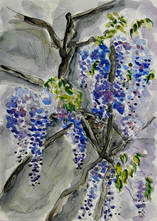
The wisterias are magnificent now, their beauty cascading over walls and pergolas and trees and gates, windows and towers, roofs and even pathways. I just had to take on a painting or two, try and capture a little of their glory.

I tried twice again, not being too happy with the first try. I took on another corner, more “architectural”, more detailed, brighter colors, with which I am quite content..it feels like “me”.

dsc_0003-4.jpg

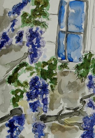
And I just can’t get away from it- detail- I need detail. Without it, I can’t stress. I can’t be obsessive compulsive. Without detail in my life, I can’t experience beauty. I can’t create beauty. Without detail, life is very foggy and leaves only an impression of what might be out there…very much like the first painting of these wisterias.

dsc_0011-3.jpg

Watercolor and ink on Arches HP
23 x 31cm (9″ x 12″)


14 comments:

Fanta said…
Wonderful again, Ronell. I love the way the shadows “dance” on the wall surface created by your careful layering, especially in the first one.
Have a great Sunday!
April 22, 2007 2:01 PM  
Lindsay said…
I like how you do these a couple of times! Lovely job.
I’ve been trying to get my wisteris to bloom for YEARS. Stubborn things refuse to flower.
April 22, 2007 5:14 PM  
Teri C said…
You are persistant arn’t you! The signs of a good detail person….I recognize it because that’s me too.Those wisteria are wonderfu and beautiful. So glad you persisted to your satisfaction.BTW, I was just reading about creativity and a detail person is called “bios’ or the dteails of life, and the person that has an overview of things is called ‘zoe’ or the essence of life.

Hmm, I bet that is more information than you wanted! 🙂

April 22, 2007 6:43 PM  
Lin said…
GORGEOUS GORGEOUS GORGEOUS!!!! The frost nipped ours and I haven’t seen much since then — so I am thoroughly enjoying yours!! Did you know you can eat the flowers?? BUT ABSOLUTELY NOT THE SEEDS!!
April 22, 2007 11:13 PM  
Lin said…
PS — I’M RIGHT THERE WITH YOU AND DETAIL … MAKES ME SO UNCOMFORTABLE WHEN I LEAVE IT OUT!!! Hard to learn to live with simlicity — i do love the detail!!! lol
April 22, 2007 11:14 PM  
Dave said…
I love wisteria, and you’ve really captured it in these lovely pictures!
April 22, 2007 11:36 PM  
beautiful! i LOVE wisteria and the draping laziness of it. great pictures!
April 23, 2007 1:59 AM  
Nancy said…
Love the wisteria – I, too, have been trying to get mine to bloom – they are 9 years old now. Is there any hope?These a gorgeous!
April 23, 2007 5:13 AM  
aPugsLife-laserone said…
Oh my gosh, I just love these! My favorite is the first one. I’m such a sucker for blue. Very beautiful! 🙂
April 23, 2007 9:26 AM  
caseytoussaint said…
These are both beautiful, but the second one does more to convey the delicacy of wisteria – such a tough subject.
April 23, 2007 10:59 AM  
Sandy said…
I love Wisteria and mine is huge, but never blooms !!!!! I want to paint them too!!! Just Lovely! You have been busy!
April 23, 2007 5:07 PM  
Carole said…
I’m another wisteria fan, and I agree that you’ve really got the essence of wisteria in this second painting. The twisted branches and those wonderful long cascades of blue/lilac flowers. I once painted the detail of just one of those tiny little flowers – I may post it on my blog.
April 23, 2007 10:55 PM  
phthaloblu said…
I understand all about detail. Yep! As much as I try to get away from it, I am only happy when it looks like what I’m looking at. These are both so beautiful. I love wisteria, too, the way it hangs and looks. It’s all around my house, but not in my yard. Wonderfully done.
April 24, 2007 3:15 PM  
platitudinal said…
Thank you for your unrelenting pursue of details, we all benefit from it and get to enjoy the beauty you created based from your search.*Honestly speaking, though, Ronell, I think both takes of the wisterias are appealing. 🙂

Three times different

These are the results of my drawing afternoon with Casey yesterday. I tried something different to get out of my rut and ran into all kinds of trouble. Not that I can define “something different”…

dsc_0007-2.jpg

The first one is just plain ugly and I’ve deleted it a few times from the blog, but decided finally to keep it. I wanted so many things fitted in and I chose the smallest format. I didn’t even complete it, just grabbed a brush pen and filled in some rough lines.

_scan10027.jpg

After Casey had left, I gave it another try, obstinate to get this scene in my pocket! I don’t feel much for this sketch…proportions are completely wrong, some ugly darks, even more cramped, in spite of a bigger format. Overall just a bad, disturbing painting that makes me want to come up for air.The third one I did this afternoon and decided it would be now or never. The plants need to get into the ground. I was still obstinate, so I kept to the same scene. I used an even larger format and this time I did use all the space. There is still too much detail and finicky pieces and not enough depth, but this it! I still can’t say what it is I wanted to do differently. I at least hope this last one broke my spell. 

dsc_0010.jpg

 Watercolor on Fabriano HP. See Casey’s painting from yesterday, she also tried something different…take a look http://caseytoussaint.wordpress.com/


16 comments:

Dave said…
You’re too hard on yourself! And anyway, trying something different is always with doing!
April 18, 2007 10:21 PM  
bec said…
I like the way you made the table and chair less of a focal point in the third try….it doesn’t compete for attention. I want a table and chair set like the one you painted. I bet your garden is beautiful!
April 19, 2007 1:26 AM  
Lindsay said…
I love them all! This was a hard subject and your really stuck with it. I wish I could come out with you and Casey!! Lucky you.
p.s. This is supposed to be “FUN”.
No being mean to yourself!
April 19, 2007 2:56 AM  
Brenda Y said…
Third time is the CHARM! I really like this! It’s so “SPRING.” Truly, this would look fantastic framed and hung on a sun porch. I love all the objects (particularly fond of the hat) and the pop of color from the pot of flowers is just perfect.
Thanks for posting all three! It’s really encouraging to see the progression and perseverance!!
April 19, 2007 3:21 AM  
Teri C said…
Bravo to you for your persistance. I love the third one but I also like the other ones too. It looks like a difficult subject, and I’m sure you learned a lot on the way.
April 19, 2007 4:51 AM  
caseytoussaint said…
Ronell, all three of these came out great. I don’t think the first one is ugly at all, as a matter of fact I think it’s full of charm. On the second one you’ve done an incredible job on the chair – you can just feel the texture of the metal basketweave, and the third is light and airy.
You have a distinctive style in watercolor, very elegant and yet relaxed(very French somehow) that brings to mind illustrations from the 1950s.
April 19, 2007 8:21 AM  
Carole said…
Actually, I really like the quality of the lines on the first one, and I also like the tones of the wash. The third one has a nice quality of light to it, and I love the flowers, particularly the flower on the hat. It’s a beautiful composition overall, so well done for sticking with it! I think it bore fruit, don’t you?
April 19, 2007 2:36 PM  
Sandy said…
Glorious taste of springtime, I love your work and envy you and Casey and your challenge/committment – Can’t wait to see them each week, who knows maybe I can join in some time.
April 19, 2007 8:11 PM  
platitudinal said…
What a dedicated artist you are! I love all of them. And, I’m glad you posted all of your tries. Each one has something special that the other doesn’t have.
April 20, 2007 12:35 PM  
Jana Bouc said…
Good for you to keep going until you get what you were striving for. The funny thing is that my favorite is the first one. I know it didn’t capture the look you wanted but it’s still a wonderful piece. The last one is technically better but the first one is full of energy and expressiveness somehow. They’re all worthy of appreciation though and not at all ugly!
April 20, 2007 6:06 PM  
Ujwala said…
All three are wonderful but I too especially like the first one.All the best with your new goal.
April 20, 2007 8:50 PM  
mARTa said…
well, the first one has it’s own charm, What I like about the 2nd one is the chair and compositon. The 3rd is light and airy and just as lovely.
So where is France are you and Casey? I will be in paris for 8 days in October…just roaming and skething…maybe we can meet and paint?
April 22, 2007 1:54 AM  
aPugsLife-laserone said…
These are really great! I love how determined you are. 🙂 🙂
April 22, 2007 4:21 AM  
Linda said…
Well, I love the last one, so I guess the third time is the charm, although I don’t know how you did three paintings of the same thing — all in a row! I would have been pulling my hair out!
🙂 All three have their good bits, though, as I think has been well stated by earlier commenters.
April 22, 2007 2:26 PM  
Africantapestry said…
thank you for all the comments…much apprecaited!
Ronell
April 22, 2007 4:29 PM  
phthaloblu said…
Don’t be so hard on yourself. Any time you step outside your comfort zone, you are going to be challenged. Not only on how you see your subject, but on how you interpret it also. I think these are wonderful little sketches. Keeping playing with them and something will come out of it that will satisfy you. Just remember, it’s always a learning experience.

Ugly, but couldn’t do without

I have found “ugly” to be an emotional concept, at least for me…
When you know the story behind it, “ugly!”, turns into “oohh how sweet!”
On a bad mood day, I see more ugly people than usual; my car is ugly, which is usually not a problem, since I couldn’t care less about a beautiful car; the dry winter scenes, which are normally architectural masterpieces, are just plain ugly and my bedroom mirror, which is most days a sweet and kind soul, shows its mean side.

Today isn’t a bad day, so I couldn’t find anything ugly around me. Even the dishwasher and washing machine, fridge…all those machine-things have their beauty today, maybe because they still do their job so dutifully?

I decided that garbage bins are my love-hate passion in life. Every day. They are not emotion-related. They are a cruel reality of life on earth. I hate every form of waste… energy, time, food, water, garbage…A Garbage bin to me, signifies the ugly side of life. But I couldn’t do without it. In shame I hang my head and I embrace my bins, glad I only have to fill them and someone else, more courageous then me, will take care of the problem elsewhere! So, here I give you the ugly side of my life and unfortunately, yours as well….

I wanted to depict these bins as ugly, so I gave only 5 minutes to myself to do each, wash included and I kept to it. I used Pentel brush pen and watercolor pencils; black….and red and green for a touch of beauty, since this isn’t a bad mood day….

_scan10022.jpg

_scan10023.jpg

Kunya said…
Nice take on the subject and I amazed what you can do in 5 min.
April 12, 2007 7:03 PM  
Lin said…
Your words are so RIGHT ON!!! And you made those can beautiful, my friend!!!! I may have to tag onto your idea … I am having a hard time with this challenge!
April 12, 2007 7:17 PM  
Sandy said…
Wow – nice sketches for 5 minutes!! Yes ugly but sentimental by necessity!!
April 12, 2007 8:36 PM  
Shirley said…
Fabulous, as always. I love this loose style.
April 12, 2007 8:53 PM  
Carole said…
Great idea for the challenge – I too am having difficulty with it. I wish I could draw this well in 5 mins! But then maybe that’s why your sketches are so alive and vibrant? I like the little touches of colour in them.
April 12, 2007 10:40 PM  
Emma Pod said…
Wonderful choice of an “ugly” item. I agree with you about mood and ugliness….they do tend to go together. I like the gray tones in these drawing and the touches of color add something nice. You are right about the existential ickiness of garbage/waste.
April 13, 2007 1:28 AM  
platitudinal said…
Ronell, I like what you wrote about this ‘ugly’ theme. I appreciate your honesty when you admit you see more ugly people when you are in the bad mood. I see your perspective of the trash bin as a symbol of waste and how it pertains to our life.Thank you for the thoughtful post and the accompanying pictures. You tried to portray ugly, but you couldn’t help bringing some element of beauty in it … like the brilliant red of the trash bag tie, and the lush green foliage that slipped quietly in the corner.
April 13, 2007 4:50 AM  
Brenda Y said…
This post needs to be published! What a wonderful take on “trash to treasure!” You’ve made waste beautiful and given us so much to ponder as far as how our moods effect our outlook. Thanks!
April 13, 2007 6:00 AM  
caseytoussaint said…
I thoroughly agree with everyone’s comments – this is a wonderful post, and you’ve made charming drawings out of a rather un-lovely object. I just love the touch of color. Beautiful work, Ronell.
April 13, 2007 8:16 AM  
Africantapestry said…
Thank you for the comments, everyone.
While I was doing this post, I thought how I would enjoy doing more “important”(by lack of better description) art, not pretty pictures, but art that touches, rises questions, thoughts, discussion, even controversy…but to do that, you have to be brave and a bit careless, I think, not worrying about hurting feelings all the time, like I do!
I am working on that though, searching for how I can say something important with my brush…
thanks
Ronell
April 13, 2007 8:23 AM  
Deb Salter said…
I really liked your thoughts on ‘ugly’! And your drawings are amazing, I hope it doesn’t spoil it, but they’re really attractive bins!
April 13, 2007 2:10 PM  
Anonymous said…
Hello. These are incredible, great obervation and take on the challenge!
Patty
April 13, 2007 3:46 PM  
bec said…
I so agree with your ideas about this challenge–I’m having such a hard time finding something “ugly” to draw. Your trash cans are beautiful!
Bec
April 13, 2007 5:16 PM  
Silvia said…
Really wonderful idea on “something ugly”. :)!!
April 13, 2007 9:13 PM  
MrsSnowy said…
You get no points for Ugly because, as has been noted, you’ve made your trash cans beautiful! I love that tone and the character in your lines! You do get a star though, for a great post. 🙂
April 14, 2007 6:44 PM  
SCquiltaddict said…
TOOO funny and what a great job with a great idea!
April 15, 2007 1:30 AM  
nita said…
Great interpretation of the theme and excellent sketches for the limited time allocation. Love those little hints of colour.
April 15, 2007 5:35 PM  
Africantapestry said…
Thank you for all the kind comments.
Ronell
April 15, 2007 6:04 PM  
phthaloblu said…
Nice choice for the theme. I, too, hate wastefulness of any kind, and I think it’s worse when you can SEE it. 5 minutes? Wow, I am amazed what can be achieved in that amount of time. Well done!
April 16, 2007 4:23 AM  
Teri C said…
it’s perfect for ugly and sooooo well done.Love your little quick sketches also.

The green corners of an April garden

April is gardening month. From middle March to middle April I have no nails, no soft hands, a broken back, tennis elbows in both arms, arthritis in my thumbs, I shuffle like an old woman and I smell of compost. All because of the love for a garden.

I have only white and blue/purple in my garden and of course green.Then I have one stubborn red tulip. For three years I’ve had that tulip showing up every April. For three years I’ve cut it off as soon as it flowered, put the flower in a vase, dug up the bulb and gave it to a friend. Just to repeat the process the following year. I’ve accepted the red tulip in my garden now. It is in a vase in my bedroom, I’ve dug up the bulb to give to a friend and I’ll wait for it next year.

I struggled with these sketches. I can’t get all these nuances of green down in a flattering manner. It all looks messy. Maybe it is too much green on one go…I do actually feel a little sick. SoI’ll take my leave now.

_scan10019.jpg

_scan10020.jpg

_scan10021.jpg

Pen and watercolor on Arches hp.
17 comments:

Kunya said…
Well, I realy like those drawings. You must have a wonderful garden…and to me it isn’t messy at all!
April 10, 2007 7:16 PM  
shirley said…
These are really wonderful. I love the various items you have in your garden and the meticulous depiction of chicken wire!
April 10, 2007 8:01 PM  
Sandy said…
Oh My Lord you made me laugh!!! I am right there with you girl. The sketches are lovely, light and luscious. Would love to see that rouge tulip too.
Perhaps a progression of sketches in the garden will follow?!
April 10, 2007 8:42 PM  
caseytoussaint said…
These are beautiful sketches Ronell. And Sandy, I have to tell you, she does have a very beautiful garden!
April 10, 2007 8:47 PM  
aPugsLife-laserone said…
Wow, really nice! I love the one w/ the face in the middle. That one gave me a double-take. Beautiful. 🙂
April 10, 2007 10:17 PM  
Jan said…
I see you have a beautiful and interesting garden and a great blog. Thanks for visiting mine. What an interesting garden!
April 10, 2007 10:19 PM  
Lin said…
WHAT UNUSUAL GARDEN PIECES!! BEAUTIFUL!!!! And that red tulip — what a hilarious story! Yep, we’d be in trouble together! Gardening and sketching!! GREAT JOB!
April 10, 2007 11:22 PM  
Carole said…
There are so many wonderful watercolour effects here – I have no idea how you’ve done them, but I really like them. I also like the various little faces peeping out of these sketches.
April 10, 2007 11:31 PM  
Karen said…
I know how you feel – I was pulling out old vines in my backyard today – oh my back!Very nice sketches, I’m sure they help bring some comfort!
April 11, 2007 10:12 AM  
Africantapestry said…
Thank you everybody, I appreciate the time and effort put into leaving a comment..Sandy, I’ll probably do more sketches as the garden grows month by month…the summers provide so much fun subjects in and around our gardens!
Ronell
April 11, 2007 10:46 AM  
platitudinal said…
I am already impressed by your artistic ability. And now, you further impressed me with your green thumb. Are these sketches from your garden? Oooohhh-aaaahhhh, so many lovelies to be found in your garden! I shouldn’t be surprised … you seem to exude beauty all around you.*Send that tulip my way, Ronell, I’m sure I can kill it in a second. My mom said that I’m the only person she knows who can kill a cactus!
April 11, 2007 12:33 PM  
Laura said…
They say every room should have a touch of red, so maybe the same thing holds true for gardens! (Though I don’t remember seeing anything red in the white garden at Sissinghurst ;D.) Your cool and subtle palette works very well indoors and out!
April 11, 2007 2:12 PM  
Brenda Y said…
WOW! I love your sketches – I do hope you do more of your garden!! I especially like the water feature, I can almost hear the tinkling of the water.
How hilarious about the tulip! After you dig up the bulb, someone must be sneaking a new bulb in the ground while you sleep – ha.
April 11, 2007 4:26 PM  
phthaloblu said…
These are beautiful! I don’t think they are messy at all.
April 11, 2007 5:46 PM  
ksklein said…
I hope I don`t offend you with my comment. But somehow your second pic reminds me of HULK. 🙂 Specially because I went to an exhibition tod;) and one of the artists topic was Hulk. Maybe I`m crazy! 😉
April 11, 2007 11:15 PM  
Robin Neudorfer said…
What a lovely place to practice something that is enjoyable. There is nothing as special as honoring your riches. I love how you captured the water in your last painting, and the effect that you created on the front leaves. Continue doing what works and explore with what you want to improve. Seems like you are on the right path.
April 12, 2007 5:35 PM  
Africantapestry said…
Thanks Robin….and ks klein, no I’m not in the least offended and yes, I can now also see how it might come from Hulk. To tell the truth, I felt a bit like the hulk after I’ve done all this green! Thanks for the comment.
Ronell